
Choosing art materials is as personal as choosing friends. What works for me may also work for you. Here is a page showing you the art materials I use for my drawings. Some of my drawings are 100% coloured pencils while others use wax/oil crayons combined with coloured pencils.
SCROLL TO THE END OF THIS PAGE TO FIND MY THREE METHOD-SHARING LINKS.
My favourite paper is Arches Aquarelle hot-pressed watercolour paper 300 or 356 gsm. This is a wonderfully strong paper which suits coloured pencils and oil pastels very well.

As well as single sheets, Arches Aquarelle is available in blocks of 20 sheets. Below is the largest size block (18 x 24 inches).


“Sunrise Reflected” is drawn on a page from the Arches Aquarelle 18 x 24 inch block.
In 2013 I joined CPSA (Colored Pencil Society of America). One of the main reasons I joined was to gain access to their “Lightfastness Test Result Workbook”. CPSA has independently tested many brands of pencils to see how resistant they are to fading. Within each brand, some pencils are very light-fast and some are extremely prone to fading – or they even change colour over time (known as fugitive). Learn which colours are safe to use and which colours to absolutely avoid by joining CPSA and accessing their test results. [January 2017: CPSA have just released their 8th version of this workbook.] http://www.cpsa.org
A brand of pencils which has the highest light-fast rating throughout its whole colour range is Luminance 6901 made by Caran d’Ache.

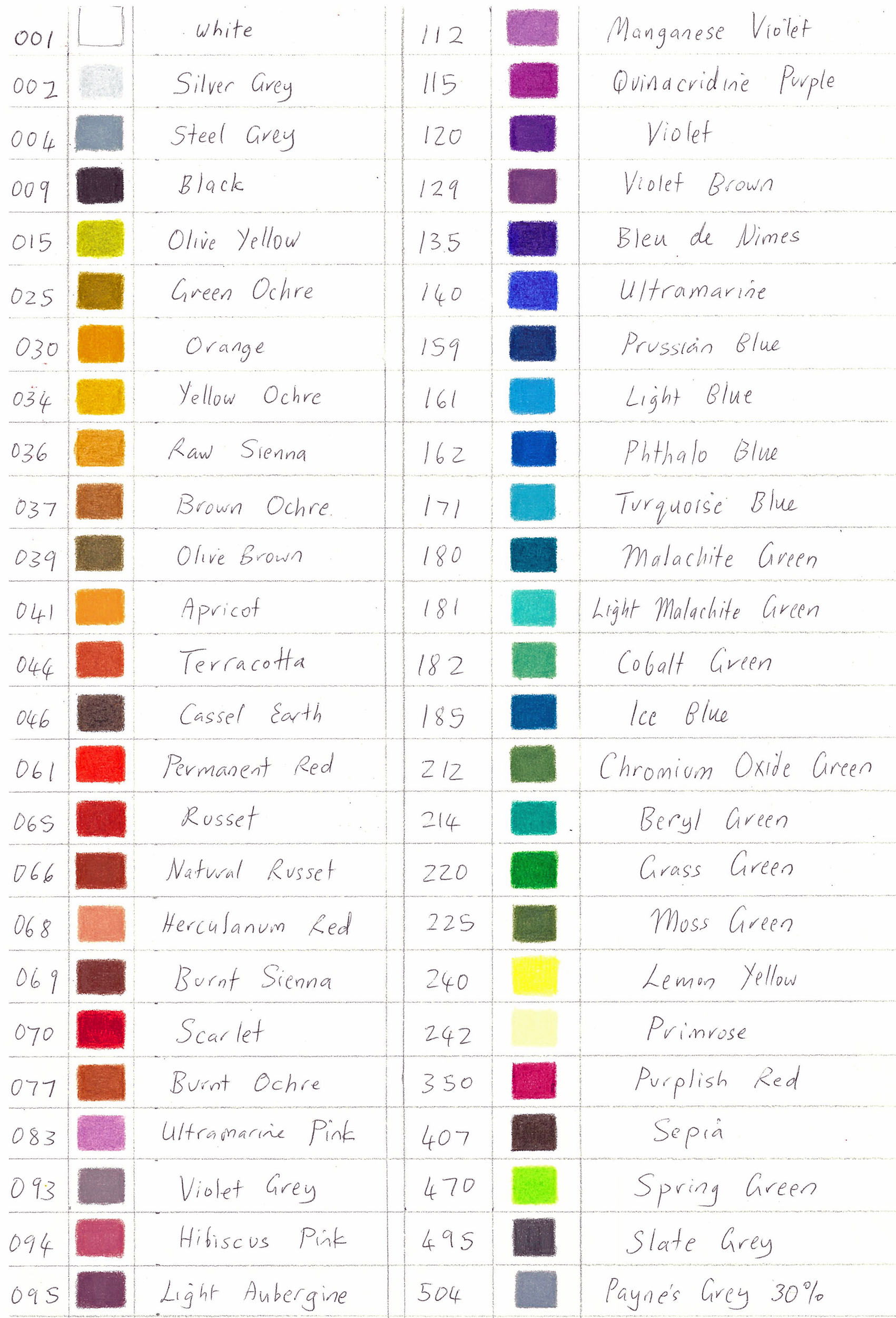
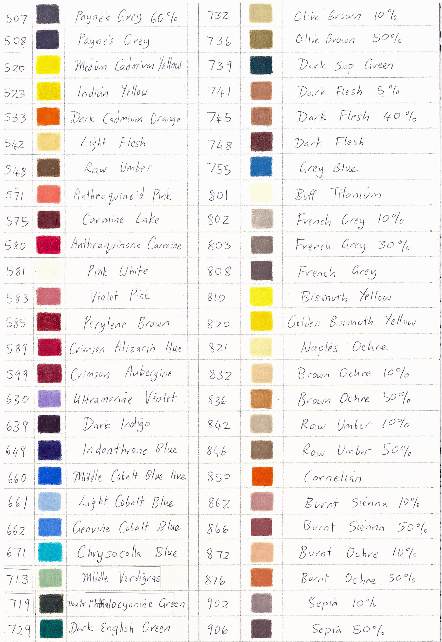
24 new Luminance colours were released in July 2020. There used to be 76 colours but from July 2020 there are 100 colours.
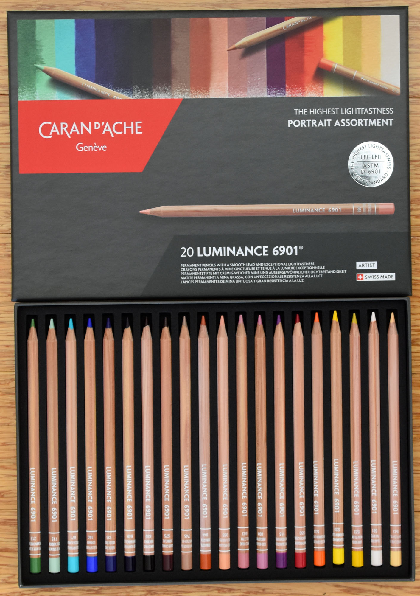

See the colour chart of the full 100 Luminance 6901 colours further down this page.
One colour worth its weight in gold is No. 639 Dark Indigo. It is a very intense and dark blue, as dark as black. Black can muddy-up or dull other colours whatever your medium is; paint, pastel or pencil. Dark Indigo may now be used instead of black. It is rich and such a CLEAN dark colour that it is perfect to either layer with or use on its own. It enriches any colour it touches, adding to its lustre rather than subtracting from it.


I use a pencil extender to lengthen my pencil so that I can use it in a painterly loose way rather like a paint brush. A good pencil extender is made by Generals. Generals ‘The Miser’ Pencil Extender
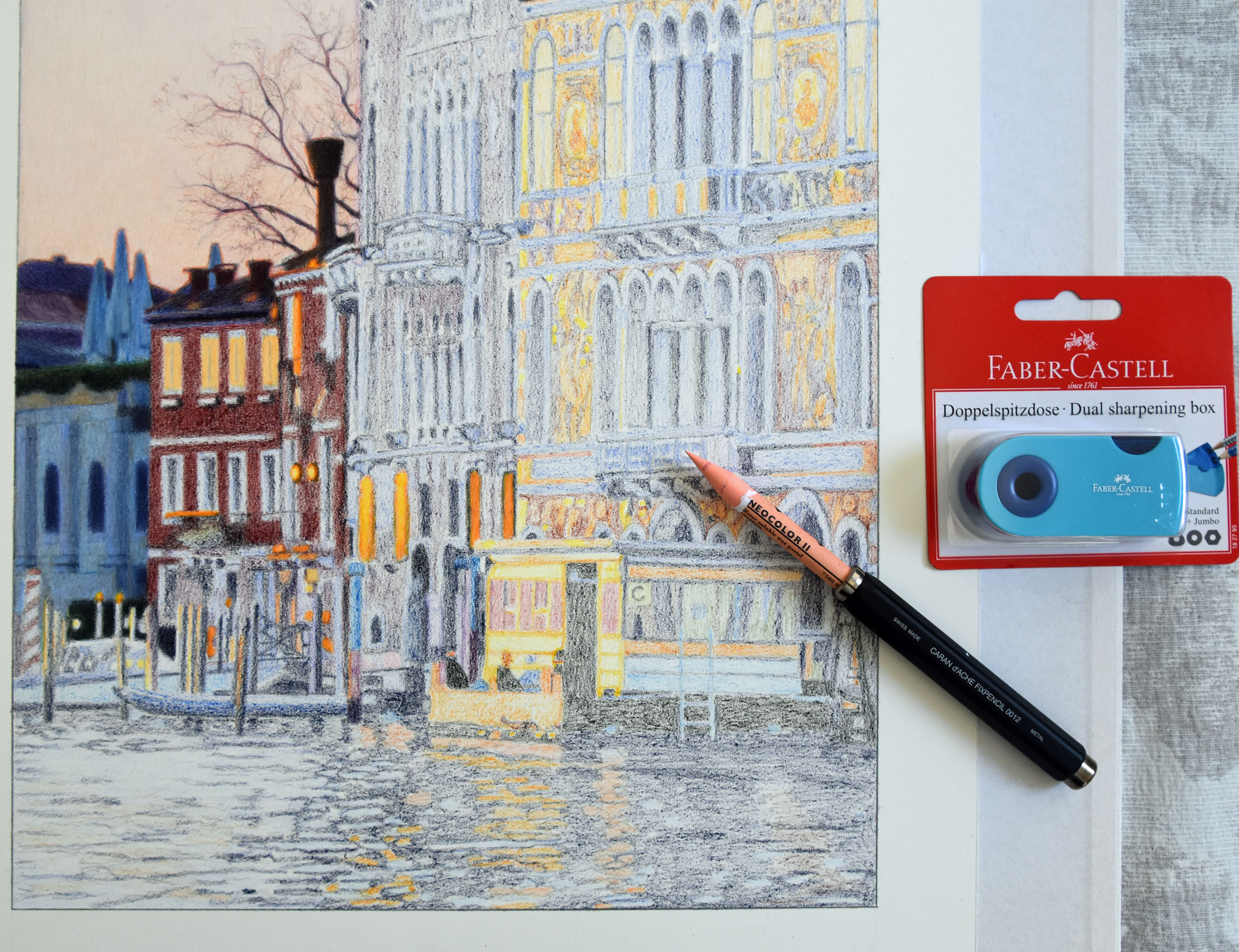
In late 2019 I found an extender made by Caran d’Ache called the Fixpencil 0012. It holds Neocolor and coloured pencils. It is a streamlined tool, comfortable and light to hold.

A bristle brush, the type you use for oil painting, is excellent for blending coloured pencils. In the drawing “A Room with a View” I used a brush to push the colours together and into the paper. The result looks more like paint than pencils. There’s no water involved; just pencils and a dry brush to blend.

Coloured pencils and oil pastels work beautifully together to make strong vibrant mixed media drawings. To read about my technique using oil pastels and coloured pencils together, please see the post Brush and Pencil.


(A suggestion: If you have to do a large area of one colour – such as the sky in “Surveillance” – it is very tedious to do with coloured pencils alone. Before you put any pencils on, put a light layer of Neocolor I, II, Neopastel or Sennelier oil pastel on the paper. Once you have covered the area with Neocolor or pastel, you can layer over with your pencils. This gives the pencils something to grab on to. It saves time and creates a nice even area of a colour.) See Brush and Pencil

Sennelier oil pastels. These are smooth, moist and creamy pastels. I used them as an undercoat in “Walking with Claude” pictured below. Then I layered coloured pencils over the top of the pastel undercoat.


Sometimes I apply oil pastels with a bristle brush – the sort one uses for oil painting. It is a technique I call “dry painting”. I push the pigment into the paper with the brush. Working this way means I also need odourless solvent to clean the brush with. Pastels applied to paper with a brush make such a lovely surface to then layer coloured pencils on top of. I find it much more satisfying to work pencils on top of a pastel surface than over plain white paper. The two media together have more substance and ‘weight’ than just pencils by themselves. The saturation and vibrancy of hues which comes from the union of pastels and pencils is astonishing.
In “Time and Space” below, I used Caran d’Ache Neopastels as undercoat for the whole drawing except for the rose. Why? Neopastels are fairly dry and can be used in a very subtle way. I wanted that particular subtlety for the surrounding scene. For the rose I used an undercoat of Sennelier oil pastels because this pastel’s character is bold. It is a moist, creamy and strong pastel so great for areas that I want to stand out.
Another example of the differing qualities of Caran d’Ache Neopastels and Sennelier oil pastels: In “Still Life”(below) Caran d’Ache Neopastels are used as undercoat on the left side (the slightly distant buildings and signs). For the detailed wall on the right and the ‘sens interdit’ (no entry) street sign I used the bold Sennelier oil pastel. Can you see the difference? One is subtle and the other is as solidly opaque as paint.

February 2018
In 2016 while visiting Sydney I came across Kadmium Art + Design supplies, a very well-stocked shop which sells OPEN STOCK of all of my favourite Caran d’Ache products; Luminance, Museum Aquarelle, Neocolor 1 and 2, Supracolor Soft, Pablos, Neopastels and more. They also sell open stock of Sennelier oil pastels. They ship Australia-wide. Here are their details: 80b Bay Street, BROADWAY NSW 2007. website Kadmium.com.au or phone: +61 (0)2 9212 2669

The following is a list of suppliers’ and manufacturers’ websites:
Caran d’Ache: www.carandache.com – Swiss coloured pencils
Sennelier: http://www.sennelier-colors.com/en/Oil-pastels_4.html
Arches Aquarelle paper – Arches Aquarelle is my favourite paper for coloured pencil work
Dick Blick Art Materials Dick Blick supply artists world-wide.
Kadmium.com.au Kadmium Art + Design supplies in Sydney. They sell open stock and boxed sets of Caran d’Ache products and ship Australia-wide.
Melbourne Etching Supplies www.mes.net.au A Melbourne stockist of art papers. They ship Australia-wide.
parkersartsupplies Parkers Sydney Fine Arts Supplies in Sydney – A treasure-trove of a shop where I buy my Arches Aquarelle blocks, plus Sennelier and Holbein oil pastels.
TheArtshop.com.au in Melbourne has a huge range of materials including Caran d’Ache. Their email is sales@theartshop.com.au or visit their website theartshop.com.au
You might like to check out my post Caran d’Ache Open Stock Available in Australia
The Exceptional Box – a post about the most amazing box of pencils you’ll ever see.
Thanks for looking at my Art Materials page. If you would like to peruse my other blog posts please take a look at the Contents of Posts Index


Speaking of colour, here are the full 100 Luminance 6901 lightfast colours.
In January 2021 my website was upgraded and beautified. You can see over 40 years of paintings and drawings in many different categories HERE. I’m delighted to share it with you.
SHARING MY METHODS IN THREE POSTS
I have created three posts where I share my methods, inventions and ideas.

- I share my methods of impressionistic drawing, showing six progressive steps of “Daydream” in the post Perfect Partners: Neocolor and Luminance


2. I developed a way of using white underneath colours to make them glow. The drawings “Art” and “Super Dry” are each shown in six steps with explanations in the post Undercover White

3. In Brush and Pencil I explain how I use pencils in conjunction with oil pastels, wax pastels and paint brushes.

Thank you Julie for giving us so many details. It makes me understand your art better and how hard you work to obtain the best results 🙂
Thanks for the opportunity to see behind the process and for the trouble of writing the blog. I am very new to coloured pencils – in fact so new that I have the pencils but havent really started yet. My initial inspiration to have a go came as a result of visiting one of your exhibitions.
best wishes
Malcolm
Hi Malcolm, that’s exciting. What pencils have you bought? There is nothing as nice as a brand new unused box of pencils! If you find that you want to try the Holbeins from Japan at any stage, I can let you know how to get them in Australia. I’ve found the source!
Hi Julie It was at your Kingfisher Gallery exhibition that I got inspired. Given how long ago that was you can see that inspiration takes some time to percolate through me into action. I agree about new boxes of coloured pencils, in fact I need to watch that buying them doesn’t become an end in itself. I find colour stimulating and can simply enjoy opening the box to look. However as working with coloured pencils is meant to be my retirement learning curve I am going to need to go somewhat further. Thanks for the generous offer to answer questions.
best wishes
Malcolm
Hi, dear Julie, it’s a while I am away from your beautiful blog, but I have that set and I love it so much, and dark blue indigo is great. 🙂 Holbein, I’ve bought from Japan years ago. Love them too.
Hello Laura, so lovely to hear from you. I hope that you are very well and that life in Italy returns to normal. It seems to be doing so here. xx Julie
I loved Malcolm’s comment about enjoying opening the box of new pencils just to look at. I did the same many times before I actually started a drawing. In fact I ended up leaving the box open on my table for ages and unused just so I could look at the 120 delicious colours each time I glanced that way. Now I have seriously started and can understand what you meant, Julie, when you wrote that from beginning to the finishing of the first layer can take a few weeks. It is very time-consuming work but at the same time so relaxing. Can you please detail for me how you go about tracing? I know this should be simple. Do you use velum? Do you spread a layer of 6B pencil on the back of the velum once it has been traced off the original? I have done this and wondered if there was a better way.
Thank you,
Brigitte from Dromana
Woohoo – a question! Hi Brigitte. Regarding tracing, velum might be a better way than my way. I don’t know as I have never tried your way. I make a photocopy as I said somewhere on this blog. For the big drawings I have to make a couple (sometimes even four) photocopies of the different parts of the picture and then carefully match them up and sellotape them together – as most of my works are bigger than an A3 sheet of paper (the biggest sheet my photocopier can take).
Once I have the photocopy, I outline the main lines and tonal differences on it with a black Faber Castell Polychromos pencil. This can be a slow process, depending on the size and complexity of what is on the photocopy. I have to be able to see the lines through my heavy Pescia paper.
Hence I am doing all the trace lines twice – first on the photocopy – and then on the paper FROM the photocopy. I sellotape the photocopy to the back of the paper and then using a lightbox, make my tracing.
My lightbox consists of a bench with a rectangular hole cut into the top of it – and a thick sheet of perspex covering that hole. In the space under the perspex I have a neon light.
Does this explanation make sense?
Hello Dear Julie – apropos of ‘bigger pieces’ what kind of paper do you use for those? Do you ever use rising mount board? I think Legion is the brand. Thanks so much. Lilian
Hi again Lilian, I use the same paper all the time; the Arches Aquarelle smooth. I am not experimental when it comes to surfaces. I know what suits me and I stick with it. Therefore I haven’t tried the board you mention. Thanks for the question! I always enjoy answering art questions.
Ah ha – the secret for your method is a lightbox. Thank you, Julie, for your clear explanation – a very good method but in the absence of a lightbox I will have to continue with my way for the time being.
Brigitte
Well Brigitte, it is what I have NOW. However before I had one I used to tape the paper to a window. The sun was my light box. Standing at a horizontal surface to trace is more comfortable for me than a vertical one though.
What an absolutely fabulous idea Julie. I will try that out – simply because I like trying out different ideas! (And I’m not sure I really like my method anyway.) I have noticed that my method can leave a film of lead on my pristine white paper where my right hand has been resting, which I’m not even sure completely disappears when I blow it off.
Brigitte
OK, Brigitte. You’ll need to have a strong dark line on the photocopy (or whatever you are tracing from) as the window light isn’t quite as strong as that from a neon light in a lightbox. And I think you need a reasonably bright sunny day.
Regarding your hand resting on your drawing, have you tried putting a piece of white paper between your hand and the drawing? This is always what I do; just normal white photocopy paper, which I change when it gets a bit grubby.
Hi Julie, Enjoyed reading your site and thanks for sharing your ideas, materials etc. I also have been experimenting with coloured pencils ( and graphite ). Trying watercolours also but dont seem to be able to control them very well. I really enjoy drawing botanicals and bugs etc but still a lot to learn.. I have purchased a couple of books and every one seems to have there prefered way. Do you purchase your Magnani Pescia paper locally. I also live in Perth and find materials sometimes difficult to purchase. Keep up the lovely work and look forward to seeing your next finished painting. Happy colouring Brenda
Hi Brenda, Thanks for the question. I buy my pescia paper through Jacksons Art Supplies in Fremantle. They have to specially get it in for me from Magnani who have an office in Melbourne. I get 100 sheets a time which costs me several hundred dollars. It is possible that they have some in stock, I don’t know because it is months since I bought my last pack of paper.
As you are in Perth I would be happy to give you a sheet to try out – to see if you like it. I live in the South Fremantle area. If you would like to visit me, go to my website http://www.juliepodstolski.com If you go into ‘contact’ send me an email. We can arrange a meeting.
Or if you’d rather not do that, I suggest you try phoning Jacksons or contact Magnani’s office in Melbourne via internet.
Hi Julie, Thank you that is very kind. I live up in the Hills but will keep in touch and next in your area will try and catch up/will also try Jacksons. Brenda
Julie, Thanks for sharing this info. I will try the Holbein colour pencils too. The paper sounds really tough. Twice recently I have damaged or torn paper supports recently, through pencil pressure, so a tough stock is a useful piece of info.
Hi Nicholas, I don’t know if you’ll be able to get Holbein pencils in the UK shops as they don’t seem to export anywhere as far as I can see. However I have a website for you http://www.japaninabox.jp A very nice guy named Hironao Tanaka owns this company which can send you the pencils from Japan. His email is japaninabox.info@gmail.com The price will depend on the current exchange rates. He sent me the biggest box (150 pencils) to Australia; it got here very quickly and he packaged it extremely carefully so the pencils were not traumatized en route. It should be easier for you to find the paper in UK though. If you get in touch with him, say hi from me.
Thank you so much for this. Much appreciated!
Very happy to have found you. Have been painting for years, but always preferred drawing. Who would have thought coloured pencils could work so beautifully? Not me.
Good morning Julie, Trawling through the internet I came across the Mitsubishi range of colored pencils. Like the Holbein they are only available in Japan although they can be accessed through Amazon.com. The point that interested me however is that they, like Holbein, have, in their bigger sets, a large number of pastel colours. I am wondering whether this reflects some very Japanese preference. Do you have any thoughts on this ?
best wishes
Malcolm
ps How’s the jet lag ?
Hi Malcolm, I have seen the Mistubishi range in the shops in Japan. I didn’t feel tempted to buy them because I had my mind set on Holbein, having already an idea of their quality. (Besides, I’d rather buy pencils with an artist’s name than a car’s name!) Maybe the huge pastel range IS a Japanese thing. In any case, I love the pastel colours (in the Holbein set) so am happy that I own them. When I look at the colours and designs in kimono, I think to myself that Japanese REALLY know about colours and quality. My next drawing will have kimono in it (an aside).
Ha – jet lag fine, thanks. It’s just that I’m not quite back on Perth time yet!
Hi Julie As you suggested Japan In a Box provides an excellent service. After seeing boxes of 50 Holbein pencils advertised on E Bay (a system I prefer to avoid) I contact japan in a box and asked if they could access those sets. The answer was of course ‘yes’ and they let me know as soon as they had been able to get them onto their website. I have now ordered a set. The box of 50 is within a price range I could stretch to ($US179) and includes an interesting range of colours. I have also purchased some sheets of Pescia from Melbourne.
I must say however that after reading your blog on “Art Rage” I am wondering whether it wouldn’t be a better idea for an a beginner like me to frame the box of pencils rather than try to do anything with them. A friend did suggest at one time that I should do this with all my pencils sets as they rarely get used although are valued. Perhaps such a piece could be could “full of potential”.
best wishes
Malcolm
ps. Hope the Art Rage has passed.
Hi Malcolm,
Well – good old Japan-in-a-box! I’m so pleased that you have used this service. Believe me, the pencils are so beautifully packed that there is no way they will sustain damage in transit. Oh – I’m quite excited that you will be trying Holbein pencils.
As to my ‘art hell’, thank you for asking, it passed almost straight after I had written that piece. It was something I wanted to get out of my system and writing it down helped to clear the block. The next morning (yesterday) I began a new piece. Plus, I decided that the drawing I wasn’t sure of, had worked after all.
Judging by the replies on the blog and on facebook, so many people know this state of mind intimately. That is why these things are so good to share.
Please don’t frame your pencils and please do use them.
Keep me updated on the ARRIVAL and what you think of them.
How are you going with your colour theory exercises?
HI Julie, In your last reply you asked how I was going with my colour theory exercises. Well there’s not much of an answer to that….very little (somethings, but not much). I would like to be able to say that I have been so pushed for time that it hasn’t been possible, but that would be an untruth. My wife does keep asking “are you EVER going to start?”. In part its the fact that just working my way through reading Itten and others isn’t something I have found easy, that is if I want to feel that I fully understand what is being said. It is also (to some extent true) that I have been putting time into working on an enamelled cloisonne wall plaque for my little grandy. Enamelling is a great interest of mine.
Your art rage blog particularly interested me because has always been in the back of my mind a question about “doing art” as a “hobby”. Can it really be “art” ? Is there not some defining elements that determine whether what a person is doing is “art” or “not art”. If there are no such elements then to me the term “art” seems to have no meaning. Perhaps art is for those who have been born with a predominantly visual way of experiencing and expressing life and the rest of us should stick to those modalities we are best at. “Doin’ a what comes naturally” as Betty Hutton once suggested. How’s that for showing my age
I hadn’t occurred to me that there could be the “blood sweat and tears” part of doing art that your blog on art rage implies. I guess I did have this romantic notion of the artist working at the easel or bench and everything just flowing from some innate special place.
Having now written what sounds like my own “art rage” blog I will continue to “puddle” and to ask a question. The Pescia paper I have bought, is there a preferred side for working on ? I will continue to collect pencils, and am certain that things will move along (its just the pace that’s in doubt). And in any case. at my age, there is always the increasing possibility that nature will resolve the issue for me.
best wishes
Malcolm
ps. I do have a question for other “would be’s” like me. I have often found it interesting when going to an exhibition or looking at the work of highly competent professional artists, jewellers, enamelllers or whoever, that some of those that I might be with have been incredibly inspired and keen “to get on with it”, I tend to feel the opposite “What’s the point ?” is a question that often comes to mind at such times. I wonder if this happens to others ?
Good evening Malcolm,
Your comment has so many parts to it that I have a feeling that I’m about to write a long reply to you.
The only easy question to answer (all the rest are difficult) is about Pescia paper having a front and a back side. The answer to that one is YES. The front side is the side WITHOUT the watermark on it. That side with the watermark also has a surface that looks like a million tiny craters if you look at it closely. Do you see what I mean? I used to clearly be able to see those craters with the naked eye. But these days my sight has deteriorated so I have to wear my reading glasses and put the piece of paper into strong light and only then can I sort out which is the front side and the back side.
So, the side with the tiny craters and the watermark is the side NOT to use.
OK, in truth I also find books on colour theory confusing. At least – I have to concentrate hard and even then some of it flies over my head. I didn’t read Itten’s whole book – I found the first part the most interesting and least confusing. I didn’t read every one of his ‘famous paintings’ colour analyses. I was fortunate that when I took the topic of art at high school a lot of this was drummed into me when I still had a fresh and malleable mind. So that it has become second nature to some extent. Then it was drummed in a second time at art school. Maybe – don’t try for the moon. Just do the most basic of the exercises … if you want to do any at all.
As far as hobbies vs professionalism, may I use the analogy of horse riding. I dabbled in riding as a teenager and then for many years as an adult. I didn’t have natural talent but I got something out of doing it anyway and took immense pleasure from doing it. So could I call myself a ‘rider’ or not? Compared to someone who had never been on a horse or someone who had hardly ridden, I was certainly a rider. Compared to a serious rider, no, I was just a person who rode for a hobby. I loved it nevertheless.
As an artist, I am aware of my limitations. Every artist has his or her own set of limitations and works within them whilst trying to extend boundaries. I don’t know any artists (and I know a few) who don’t experience the blood, sweat and tears sometimes. I’m happy to dispel your romantic notion of everything just flowing seamlessly. I think the saying is 5% talent, 95% hard work – something like that.
Anybody can say they are an artist. I have been irked at times by people who have just picked up art materials for a short time then called themselves artists…(a very common occurrence). Conversely I question how much of an ‘artist’ I am. Sometimes I feel like an imposter and I know some other artists who have had these imposter thoughts about themselves too. Any discipline where excellence is strived for is harrowing at times…even tortuous.
So ‘why bother?’ you ask? Heaven knows I ask myself the same question from time to time. Each one of us must come up with our own individual answers. I bother because nothing else I do gives me more satisfaction… in fact life is unbearable to me if art isn’t in it. As to horse riding, though, I decided that I could easily live without it so I entirely gave it up about 20 years ago. I still love horses and enjoy watching dressage and showjumping but I am quite content without having to ride myself.
I chuckle at your statement about nature resolving the issue for you at your age! You have a dry sense of humour!!! (Please don’t go to the better world for a while yet!!!)
I am glad that you enjoy enamelling. Tell your wife that MY husband has all this fabulous equipment for working with stained glass. It sits untouched year after year.
all the best,
Julie
Good morning Julie and a tremendous thank you for putting so much time and thought into your reply, it is truly helpful. Fortunately I can still the little craters in the paper when I look close.
Particularly encouraging for me was your final comment about your husband and his stained glass. Perhaps procrastination is an art form in itself, in which case both he and I can take comfort in our achievements.
It’s encouraging to know that even for artists at your level there are times of question and doubt. One thing that comes through to me very clearly both from things you say and things said by enamelling artists I know is passion. Passion for “something” about life and the world they live in and a need to express it, and to express it visually. It seems to me that underpinning this desire is an inherent ability to see and think visually (in contrast to the writer who does the same thing using words).
Once again many thanks and best wishes
Malcolm
Good morning Malcolm,
I forgot to say last night that when I visited Claude Monet’s house and garden in Giverny last April, our guide told us that Monet had a Cezanne hanging in his bedroom (there was a copy of that painting hanging there still). The painting was facing us but our guide said that when Monet had the real one in his house, he had it facing the wall! Why? Because he was intimidated by it. He would never be able to paint like the master, Cezanne. So there you are. Artists of all levels feel doubts, limitations and intimidation by others’ art.
Certainly, I believe what you say is true about the passion and the need to express it visually. Underlying it (for me, anyway) is a love of life. That love is what feeds the art.
Believe me, I procrastinate too – just that in my case it is about things in my life other than drawing.
I read recently that people who create (in whatever way) need a sense of doubt as without it they are insufferable! ie egos get too huge and ghastly. Doubt balances them.
And now … time to draw.
I DO enjoy our discussions.
Julie
I do both. I’m a painter, and a novelist. The need to create setting and character are virtually the same….
Hi Julie and thanks for the additional comments. I was interested in the response from hafandeg and was wondering whether he/she would be prepared to expand a little more on the notion that the work of the painter and the novelist are virtually the same in respect to creating setting and character.
regards
Malcolm
Hi Julie, thought I would let you know that my Holbein pencils arrived the other day. Although it is box of 50 only, the colours are great with a number of pastels I’ve not seen in other collections. I have used my Faber Castel sharpener to put a sharper point on a few but in doing so have found one colour that must have breaks along the length of the lead.
Hiranao apparently lived in Perth for a year some time ago and was keen to find where my suburb was, even to the point of going onto Google Earth. Seems a very pleasant chap and keen to provide good service
Really enjoyed looking at the paintings you are putting into the auction. As much as I am amazed at all your work it is those involving lanterns that have enormous appeal to me. Its something to do with the level of realism and a sense of mystery that seems to surround these pieces. Perhaps the starkness of the light, often against a blurry background, is what does it for me ….I don’t really know, but please keep doing it.
best wishes
Malcolm
Hi Malcolm, I’m sorry about your broken lead. I hope it is only one. It must have been dropped at some stage. I find that if I drop a pencil (which unfortunately I often do) it shatters the lead.
Thanks for your lantern feedback. I love drawing lanterns and also find them mysterious as light-giving bodies. I will keep drawing lanterns every so often as I get so much pleasure from them. I only feel that I can give up “Illuminating Dusk” because of drawing “Here Comes the Night” this year which is quite similar.
Would you consider coming on Saturday so that we can actually meet…and talk in real life as opposed to on the blog? (Incidently you needn’t feel pressured to buy anything. There will be a big crowd and many of them won’t bid.) …though hopefully some will. If you come I can introduce you to Matthew (he who procrastinates with the stained glass).
Hi Julie Unfortunately Saturday night is not an option for me but thanks anyway. Of course I have the advantage of having a very clear recollection of you when we spoke at one of your exhibitions. Perhaps it’s better this way anyhow. You know what it can be like when you develop an image of someone you listen to on radio… and then you get to see them. It can be very disappointing and I would hate to disappoint you.
best wishes
Malcolm
Very understandable, Malcolm. Gee – I hope I was polite when I met you!
Good morning Julie. Of course you were polite, couldn’t imagine you being anything else. You may remember me mentioning that when my Holbein pencils arrived a couple had broken leads (although at the time of last writing I think I had only found one) however I think I have fixed the problem. In a coloured pencil DVD I had seen the artist suggested that when this happened to just wrap the pencils in some paper towelling and zap them in the microwave for 10 or so seconds. Apparently the lead will soften and rebond. I did this (although for 20 seconds), let them cool, and then sharpened them no trouble. I guess it remains to be seen whether the lead has mended along the whole length of the pencil, but the signs are good.
best wishes
Malcolm
Hi Malcolm,
Well I never! Next time I find that I have a pencil with shattered lead ie next time I drop one on my hard floor, I will most certainly try this trick with the microwave. Thanks so much for passing on this gem of information.
All the best, Julie
Hi Julie – I came across your blog when I googled: ” where can I buy caran d’ache full blender in australia” -and have enjoyed reading the discussion between you and Malcolm 🙂
I am in Victoria – did you buy the full blender online and have you played with it yet and what do you think?…I want to try with the Caran d’ache Neocolor 11 pastels which are my favourite drawing medium – just love the density of colour that can be achieved…thanks in advance Nettie
Hi Nettie, I bought the blenders from Ken Bromley Art Supplies in the United Kingdom (on-line). I had bought my Luminance pencils from this art supplier in 2009. I just happened to be browsing their on-line catalogue recently when I saw these blenders so decided to give them a try. I haven’t used my blender very much (as the package only arrived a few days ago) but when I did use it, it gave added opacity and richness to the colour. I found I could layer more coloured pencil over the top of it to give rich colour. Caran d’Ache is certainly a beautiful art material – yes – including the Neocolors. It is a pity that they aren’t more readily available in Australian shops.
thanks for your prompt reply Julie!
I have found a great source of Caran d’Ache Neocolor II Aquarelle Artists’ Crayons online from http://www.artshedbrisbane.com.au
and you can buy single ones for $2.50…joy of joys…
happy drawing 🙂
Well, I just had a look at the site, Nettie. Couldn’t see the Luminance pencils though – unfortunately. That’s great that you can buy open stock (singles) of the Neocolor II. I can also get open stock of my pencils from Ken Bromley. Actually I’m going to be in London in December, so I plan to stock up big while I’m over there.
Lightfastness aside, which of the pencil sets mentioned above is your favorite for feel, blendability, and laydown? I have the Polychromos and I’ve just learned about the Holbein pencils. Thank you…
Thank you for asking the question, Dina. My favourite pencil is still the Holbein from Japan. While I like the Polychromos, the Holbein pencils are richer in every way including feel, blendability and laydown.
They’ve just arrived today and I’m in love… thank you for the recommendation!
Hi Dina, do you mean you bought Holbein pencils? Wow, that’s amazing. Where did you buy them from? Please tell me more…..
I bought the biggest set from a Japanese seller on Amazon (MK Japan). The price was just slightly less than the company you linked above, and they included a sharpener (T’Gaal Multisharpener – has a dial for different point lengths – interesting) and a small bottle of their Meltz solvent. They’re dreamy, and you’re right – SUCH a difference from what I have been using. Excellent range of color, beautiful coverage, so creamy and smooth.
Dina, I’m delighted. Welcome to the small ‘club’ of people outside Japan who use these dreamy creamy pencils.
Hi, could you PLEASE tell me which 77 Holbein colored pencils from your lightfast test that made the cut! I can’t tell which ones rocked just from the photo you posted. I would really appreciate it! I am a student and I can’t afford to join the CPSA to get the workbook they offer. I have a full set of Prismacolor artist grade colored pencils. They have ratings on them, I am just not sure how true those ratings are. Anyhow, I would like to know if you would buy the Caran d’Ache Luminace colored pencils and mix in other brands as well. Thanks so much.
Martha
Martha, I am sending you the answers to your questions in an email.
Could you please send me this information as well ? I know it’s an old post but I can’t find this data anywhere else.
Hi Agata, I’m not sure exactly what you are asking me to send you.
I meant to ask about the Holbein pencils that didn’t pass the lighfastness test. I have hard time telling which ones did just by looking at the photo.
Hi Agata, I have sent you the list of Holbein pencils by email. (Check your junk box if you don’t see my email in your inbox.) Cheers, Julie
Dear Julie, I have just today discovered you! Your work is inspiring, I love the rose and the signs. Amazing. I’m new to coloured pencils and I also love the Holbein and would be so delighted to know which Holbein are not lightfast. I have just a couple of pinks in Holbein and I like them. Prismacolor so far – well the leads just break so easily – and the Luminance are beautiful, and I like the Polychromos. But the Holbein are super appealing. Thanks so much.
Hi Lilian, thanks so much for getting in touch. I did the test 10 years ago and haven’t kept the results as I don’t use Holbein any more. My testing was a layperson’s so not terribly scientific. I highly recommend you join CPSA (Colored Pencil Society of America) who publish a lightfast testing workbook which includes Holbein. If you love coloured pencils and think you’ll carry on with them then the best thing you can do is join CPSA. They are an awesome group.
There would have been too many colours for me to list in any case. About half of the 150 colours were not totally lightfast when I tested them by putting swatches into sunlight for several months. Unfortunately their beautiful pastels, pinks and purples generally didn’t pass the test.
Wow Julie, thanks heaps for the reply, and so quickly! Thank you.
I have just a couple of Holbeins but mostly I love Caran D’Ache and also have a lot of Polychromos pencils. The CD’Ache Luminance are just so nice to use, even if not as precise as the Polychromos.
Thank you again, I’ll go back to those one.
I’ll be tuning in to see what you’re up to. I’ve really enjoyed reading your blog.
Lilian
Lilian, I know what you mean. Holbein are like lipstick – so so beautiful. I just wish they were more lightfast! I adored using them as well. One of their colours which I still use is called Soft White. It is the best white of all the cp whites in my opinion. I keep a stack of them.
I am a new to colored pencils although I’ve drawn in graphite all my life. I love the story you told of Monet. The first time I saw your work, I wanted to just break the my pencils in half and not even try. Now I use you as inspiration, thank you for being real.
Thanks for leaving me this message, Nick. I hope you have gotten over wanting to break your pencils. Yes, I’m as real and as flawed a human being as anyone else is!
Hello juliepodstolski, I found your blog by chance and thought I would ask a question which make of coloured pencils do you recommend I should buy, I am a real fan of Faber-Castell Polychromos Coloured Pencils, I have the lovely tin of 120.
Hi Kate, thanks for your question. I recommend Luminace pencils by Caran d’Ache because these are the most lightfast pencils in the world. They would make a terrific companion to your Polychromos as they work well together. I have several brands of pencils but I use more Luminance in each drawing than anything else.
I have to thank you, because, after your words, I was encouraged to give another chance to my Pablos.
So, I did six versions of a drawing, starting with watercolours, and, after, changing paper (Fabriano, Arches, Schoeller) and coloured pencils brands. Polychromos FC, Holbein, Pablo CdA, Uni Mitsubishi, Derwent Coloursoft.
Yet finding Pablo and Uni Mitsubishi a little hard, I have deeply enjoyed working with them. And maybe the shades and tones, in the Pablo version, are, togheter, stronger and softer.
So I have to thank you, Mrs Julie.
Now, it’s up to my old Karismas and new Luminance. But, this is time for a new drawing.
Thanks again! Your artwork is so inspiring.
Hello Laura, thank you so much for your communication. I am so pleased that my words and works have been able to inspire you in your own artistic journey. This is wonderful to read. Indeed, each brand of pencils (and paper) has its own individual personality. And like all personalities, some we like more than others. We are so lucky to have choice.
Great Blog Julie !
I hadn’t thought of combining oil pastels with pencils, you have opened my eyes to new possibilities as a newbie to coloured pencil work.
Thank you
Hi Sue, thanks for getting in touch. It makes the process more painterly, I feel, and actually more fun to do when combining the two media than just using coloured pencil by itself. I’m laying down oil pastel right now as undercoat. Doing it is so much like using oil paint. And then going over the top with pencils (later) has a satisfying feel.
Thank you for sharing.. This helped me a lot!! I’m at learning stage and I’m an art lover. I worl in many mediums..So, when I start working in a new medium I want to know every bit which paper to use, which supplies are the best for that medium..So your post helped me a lot!! Thank you! ☺👍👍
Great post..
I’m very glad that my posts have been a help to you, Ananya. That makes me feel very happy.
Ohh..😄
Thank you again.
My pleasure!. 👍
Well, amazing piece of art..All the works are really food!! Amazing!! 👌👌👌👌
Thank you, Ananya, for your words and for liking so many posts!
Ohh..Your posts are amazing. They deserve it. Thank you for sharing with us.
Well,
It’s my pleasure always
Hello, Julie, that’s Laura again. What a surprise to discover, reading this post and comments, Jackson’s is so famous! They are great! According your experience/taste, wich makes you choose to undercoat with Neopastel or Neocolor II? What you say about Sennelier is easier to “see”, as they have a very mushy consistency and e.g., in the red rose they almost offer a silky and almost 3d performance. But I am curious about the two oil and wax crayons from Caran d’Ache: the effect you want to obtain? The subject in the drawing? Their texture? What makes you choose the one or the other? Thanks in advance.
Good day Laura, lovely to hear from you this week. Let me answer your questions.
First of all, I must have mentioned Jacksons somewhere in the comments section (but I am too lazy to look through all my comments to see). I should have been more specific. I was writing about our local West Australian art store called Jacksons – not the huge Jacksons which I think is American. Our local Jacksons does not have a great variety of art supplies sadly. Hence I buy my materials mostly on-line or while I am overseas. Our local Jacksons is a completely separate company from the big Jacksons you are thinking of.
Regarding Neopastel and Neocolor, here are my thoughts. For a few months I was using a brush to ‘paint’ on pigment from Neopastel or Sennelier, and then drawing into the pigment with coloured pencils as I described in my post “Brush and Pencil”. This was followed by some more months of only using 100% coloured pencils in my drawings.
When I decided to start using a crayon in conjunction with coloured pencils again, late last year, I chose Neocolor 2. For one thing, I like the shape. I can use a knife to sharpen Neocolor 2 to a point, giving me more precision than I get with Neopastel. I found that when I used a brush to transfer pigment from Neopastel to paper, it created quite a lot of dust. There is much less dust with Neocolor 2. I am drawing directly on to the paper with Neocolor 2; no brush involved, and it is very smooth. It covers the paper quickly and easily, and feels so nice as an undercoat for the coloured pencils.
Because I can put the Neocolor 2 into a holder (Caran d’Ache Fixpencil 0012) it makes the crayon even easier for me to hold so I feel comfortable using it.
So in the end, I feel more “at home” using coloured pencils with Neocolor 2 than either using Neopastel or the very thick Sennelier. Putting coloured pencil over Sennelier could be a little bit like wading through mud as the consistency of Sennelier is so thick.
And why not Neocolor 1? I think Neocolor 1 would be just as good as Neocolor 2 however I choose 2 mainly as there are more colours to choose from in the set.
Now, may I ask you a question? Do you live in Italy? And if so, please tell me what part. I am very interested in Italy so would love to know where you are corresponding from. (Why am I assuming Italy? I can’t remember why I thought you lived there. But perhaps you live in a different country. Please tell me.)
bye for now, Julie
Hi, Julie, thanks for answering. I am from Italy, Ascoli Piceno, in the south of Marche country. It is scarcely known, small town, too, but lovely as many Tuscany towns. And where I do live is the reason I do know Jakson’s for. “My” Jackson’s is UK based, online store. Here it’s impossible to purchase fine watercolours, pencils, pastels… so I used to buy art materials in my travels: Pellegrini at Brera, in Milan, Poggi in Rome, Zecchi in Florence, or Lisbon (convenient prices) and Malaga, too, I admit. But i don’t travel anymore so often, plus, it happens I discover a new stuff and online is the only way to get it. This is why I know their website and also I use another website from a seller based in Urbino (Italy, Marche, beautiful small town too). But also talking with experienced people is useful: at Zecchi, in Florence, they recommended a watercolour paper that works fine as Arches, I’ve tried it both rough and cold pressed and I loved it so much, so that last summer I bought the hot pressed version of both brands to try with watercolours and coloured pencils, but I had no time do try yet.
So, the choice for Neocolor 2 is only a matter of huge range of colours. I see, thank you for having satisfied my curiosity. I was wondering if between Neocolor and Neocolor 2 there is the same consistency difference than between Pablo and Supracolor. Pablos are harder, while Supracolor creamy as Museums and Luminances. To use these pastels to cover huge areas is a good idea. Sometimes I used colored pencils on imperial size and it was really exhausting layering colour over colour till blending and covering the entire sheet. And I assume the lightfastness is not compromised from Neocolor 2 as they have the Luminance over.
Thank you again and have a nice time,
Laura
Now I can say to you “Good evening Laura” as it is 20:10 as I write. I have not heard of your town. I bet it is beautiful. In 2018 I visited several parts of Italy on two separate trips, from the areas where the Dolomites are – (Valdaora and Cortina), then right down to Rome, (including also Milan, Venice, Verona, Vicenza, Florence, and Vernazza.) What an inspiring country. I have looked in the window of Pellegrini in Brera but did not go inside as I didn’t require any materials at that time.
The way that I use Neocolor 2, I do not think that the lightfastness matters very much. This is because I use it so lightly. The delicately-applied layer of Neocolor is entirely covered over with many strong layers of Luminance.
For about 15 years, by the way, I used an Italian paper. It was called “Pescia” (a hot-pressed print-making paper) and was made by a company called Magnani. I wonder if you have heard of Magnani? I stopped using it because the company ceased making paper in 2015. After some months they were taken over by another company and began to make paper again. But by then I had discovered Arches Aquarelle so I did not try the new version of their paper. The company had been making paper since the 15th century so it was tragic that they stopped.
Thanks for letting me know that Jacksons is English. (I should have checked before writing that they were American!) I will remember this fact from now on.
And now I say good night to you in Italy. All the best, Julie
Hi, Julie, and “Good Night”. Pellegrini is where I bought loose Pablo, many Liquitex and watercolours, my Karisma and Polychromos sets, Windsor & Newton soft pastels box, many Arches and Schoeller blocks and sheets… what a memory… it’s near La Scala theater (ballet is my other passion). I think that the way you portrayed many Italy’s views is so peculiar and bright, even when you use dark colours.
Magnani. I know it, not your Pescia (it’s pronounced Pesha), but I have Velata (thin) and Italia, a watercolour paper that I was gifted and I used for a watercolour. It’s sad the matter that a company takes over another: I don’t know how is for Magnani, but a seller told me about an Italian brand in paints and colours that was sold, now the pigments for one of their most appreciated products are made outside of Italy and distribution is bad, as the quality, and customers are complaining about the low quality. Very sad. Arches too has changed owner: I read different brands if I turn my pads, from my first one to the last. But it seems to work fine, neverthless.
Well, thank for your answers and good night/morning.
Laura
Yes, Laura, it is very sad when a company takes over another company and quality drops. I didn’t know about Arches also having been taken over. My supply of paper was bought some years ago so I expect I am still using the old Arches. Happily I have a lot of it.
Hi, Julie. In my first one bought in 1999 I read “Arjo Wiggins”. In others bought around 2011-14 “Canson” and in the last two (2019) only “Arches”.
I’ve just checked my supply, Laura. You’re right. Most of my pads have Canson written on them but three recent ones I bought have only the word “Arches”. I haven’t tried paper from those new ones yet so am yet to know if it differs from the rest of my supply.
Thank you, Julie. For watercolours the paper doesn’t seem to differ, to me… For coloured pencils, I’ve to try… now I’m curious as I used it, the satin one, with Polychromos, Derwent Artists and Pablo (I did that last drawing in August 2017 inspired by you – I posted a comment in your blog -), but not yet the new stock.
Good to know, Laura. It will probably be years before I get around to trying out the new batch. It might actually outlast me!
Thank you so much for this. I’m only a few years into the medium and you are my #1 inspiration. Thanks, again, Julie.
Well I must say, that is a lovely comment to receive on a Sunday evening. Thank you so much, Amber.
Your art is really amazing with all that detailing wow! I want to collect lots and lots of art materials lol.
Thank you! And yes, art materials are way more appealing to me than clothes or jewellery or practically anything else – except books.
I see!!! I am a Very new blogger. This is my first reply to a comment! Thank you so much. This feels special…Yeas L love colors….unboxing them feels awesome!!!!
*Yeah I love colors
Welcome to blogs!!!
Hello, could You please inform me on the duration of Your (agreed long ago) LIGHTFASNESS Holbein chart I found on my computer ( and possibly also Your local SUN situation as compared with e.g western Europe? Would make me happy , thanks for trying to remember, frienly greetings from the Netherlands, ben peters.
Hi Ben, I did that test nine years ago (I think) so I will do my best to answer your question. I seem to remember the swatches of colour were in the window for approximately five months over our summer period. Our summers are very hot with sunshine almost every day. The pencils were in a north-facing window (equivalent to you putting them in a south-facing window).
Colored Pencil Society of America also tested Holbein and the results are in their latest Lightfastness Test Workbook. Only trouble is you have to be a member of the association to have access to it.
While I loved Holbein and used them from 2009 to 2017, I decided to switch totally to Caran d’Ache Luminance due to the lightfastness issues.
Hello, thank You for Your quick(to say the least ) response ; so much useful information as now I know how to classify them (Time-wise and also thereby including Your much harsher SUN ); very grateful to You for having solved this. Having much experience with both Luminance and Derwent Light fast ,but never liked there dark brown-blackish pencils for color ( Violet undertone Luminance) or usability reasons (Derwent for their not very dynamic range
+ bluntness a bit ). Could You maybe inform me about the Lightfastness issues, causing You to leave Holbein / their OP 182 Sepia is much preferred by me (for Mono-tinted/line-( as opposed to coloring surfaces)-drawings / like an old-fashioned Graphite =drawing. Thanks for Your time ,enjoy Your “creativity” and greetings again, Ben Peters . PS, although I work most on “tinted”paper ( e.g.Nepalese or self-grounded usually unsized ) and abstract( quite organic/inspired by nature I guess) , my Favourite Artists ( drawings) are Breughel / Claude Lorrain/ Cezanne/van Gogh +of course so many others (Morandi and so on…..).
Hi Ben, Speaking of Luminance, have you tried the 24 new colours they released in 2020? I ask because in this set is a most beautiful dark colour and one which I use SO MUCH of is no. 639 Dark Indigo. I use this in practically all the dark areas. In fact I specifically asked Caran d’Ache if they would produce such a colour; of the intensity of black but not black. If you don’t like the dark brown-blackish, you might prefer this dark blue-blackish colour.
The only lightfast issues I had with Holbein was that less than half of the set of 150 pencils proved to be fully lightfast. Whereas I want every colour I use to be lightfast. I don’t think CPSA would mind me telling you that they found the Holbein Sepia 182 to fully pass the lightfast test. So please carry on using it.