A site to share my drawings, paintings, photographs and thoughts.
Category Archives: Japan
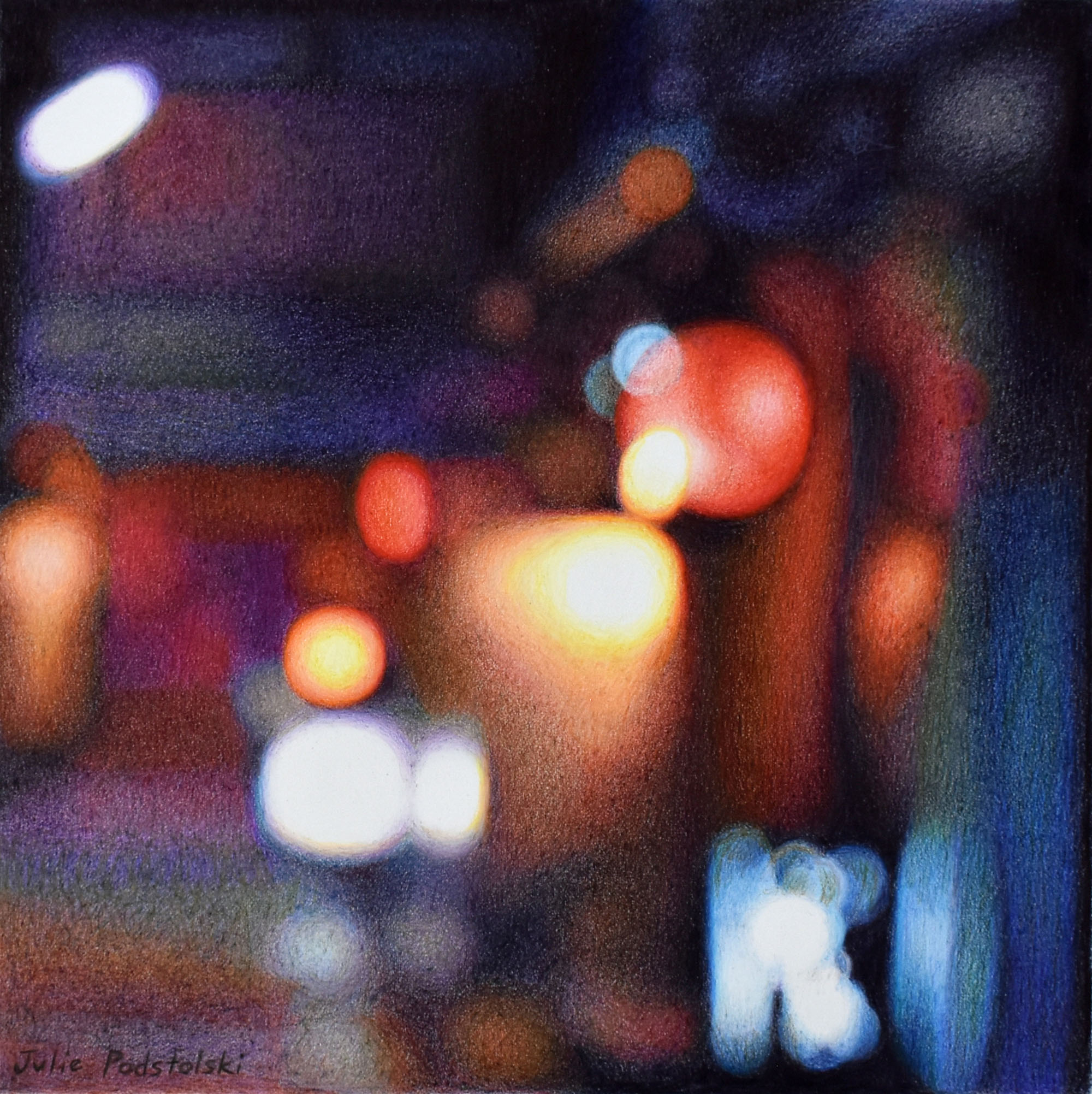
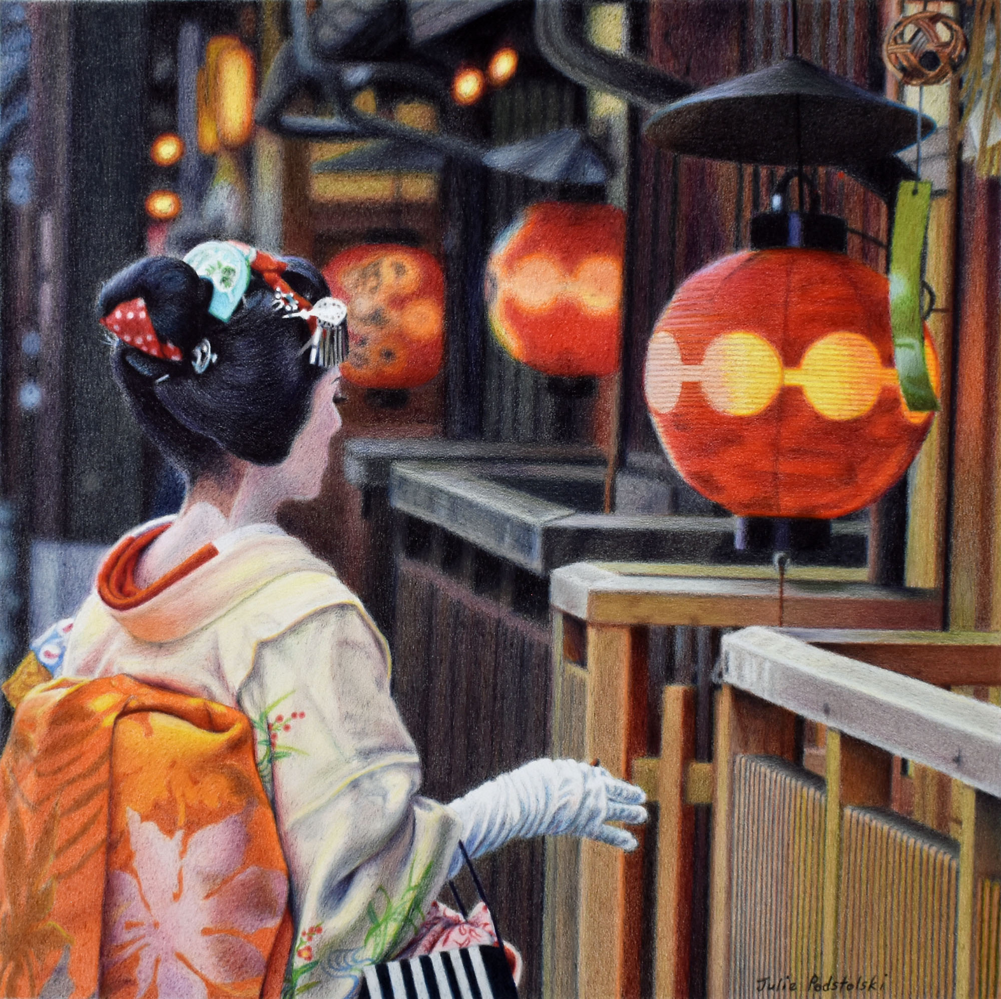
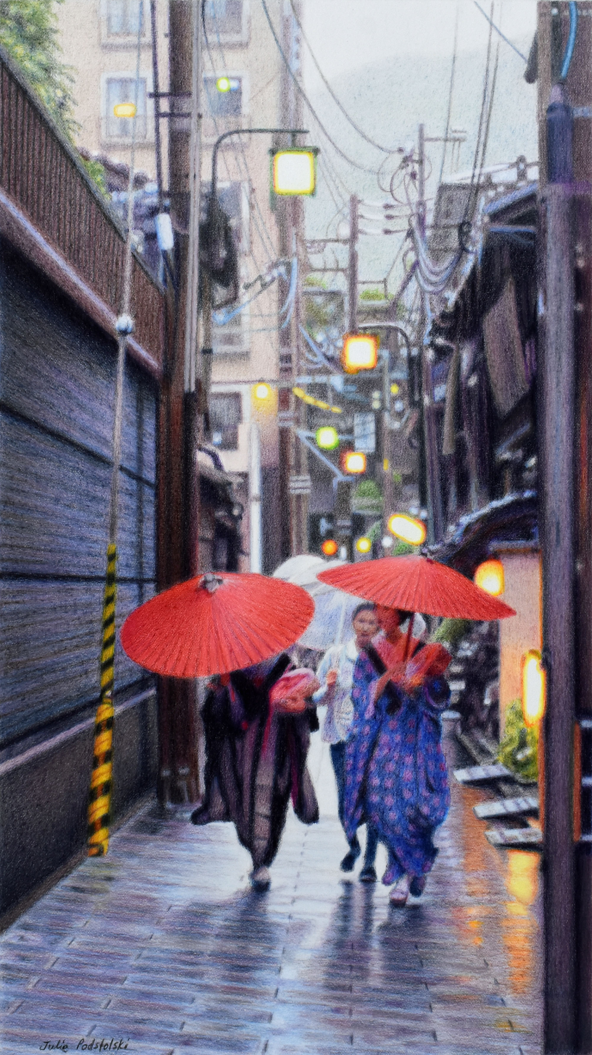
Gion Night
“Gion Night” completed late April 2024 with Neocolor II and coloured pencils, 23.5 x 23.5 cm.
Electric lights, illuminated signage and red Japanese lanterns glowing from a Gion Higashi side-street, together create a nocturnal abstract.
“Gion Night” (above) is my third consecutive drawing of soft-focus Kyoto. “Gion Night” is the most abstract of the three, but if you know the idea began with a side-street or alley-way, you can kind of see it.
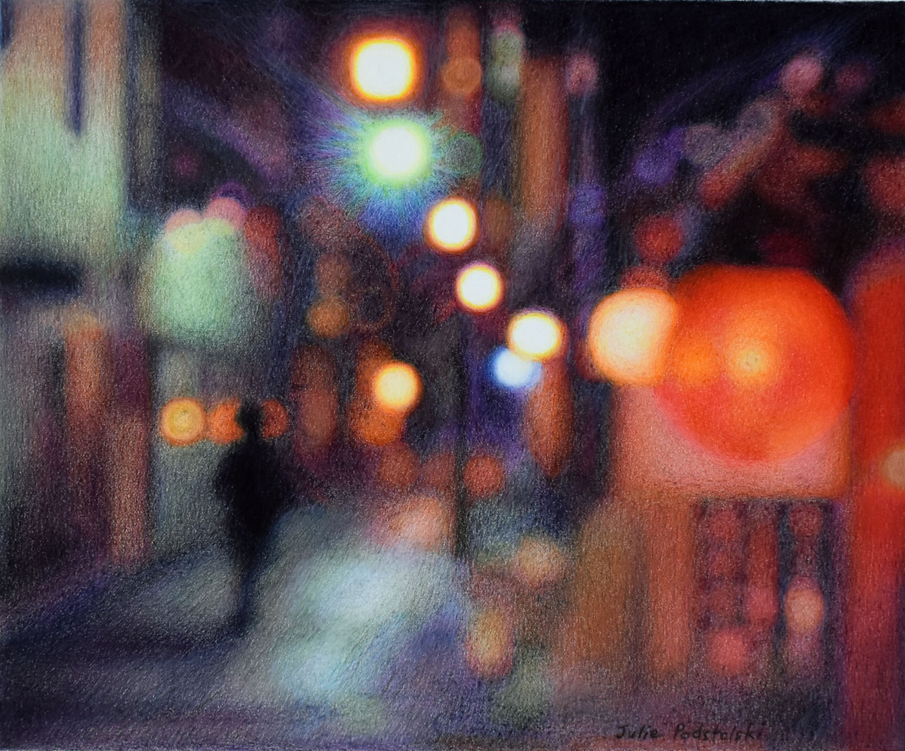
The previous two drawings are “Alone in Kyoto” and “Downtown“.
“Alone in Kyoto” Neocolor II and coloured pencils. 23.5 x 28.5 cm. April 2024.
“Alone in Kyoto” (above) was drawn after “Downtown” (below). Each drawing is more pared back than the previous one, with incrementally decreasing detail.
“Downtown” Neocolor II and coloured pencils. 30 x 21 cm, drawn in March 2024.
These three drawings have been questioning, challenging, frustrating and fulfilling in turn for me as I have sought out an impressionistic essence of evening Kyoto.
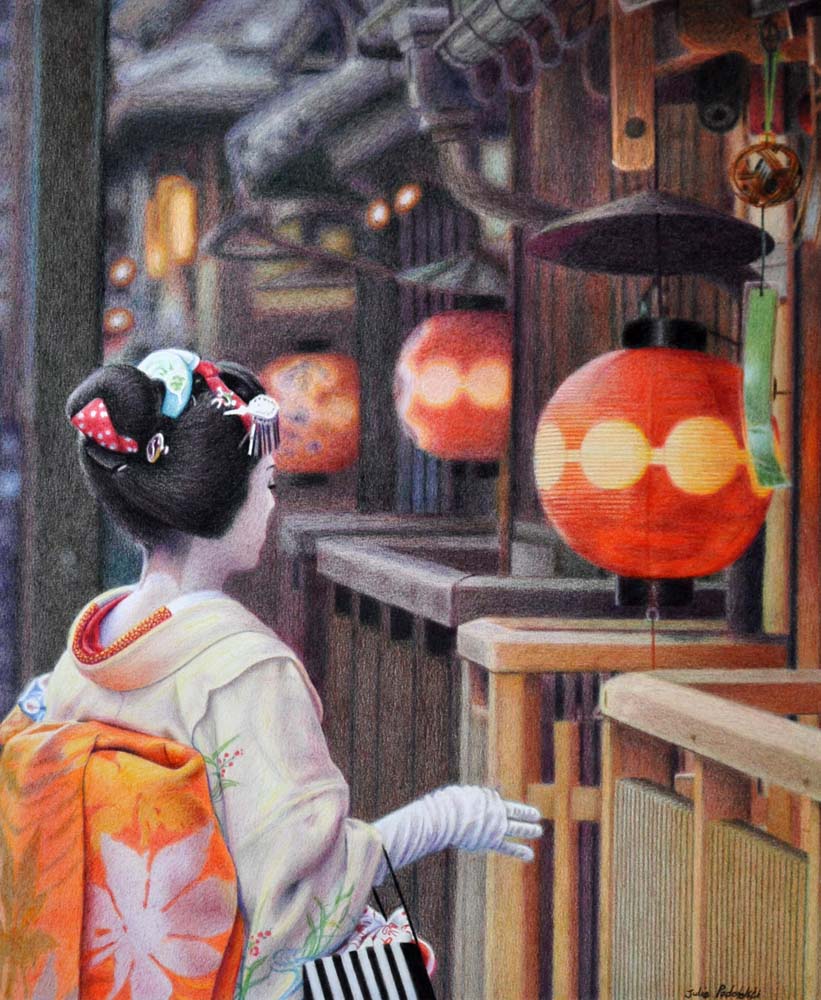
Alone in Kyoto
“Alone in Kyoto” Neocolor II and Luminance on Arches Aquarelle smooth. 23.5 x 28.5 cm. April 2024.
Last time I traveled to Kyoto I was not in a good mood during my first evening there. No doubt I was worn out from lack of sleep and two long-haul flights. I felt that I had made a mistake in coming back. I trudged around for a while in a black mood then gave up on finding inspiration and returned to my hotel room.
Looking back at my (very few) photo images from that first evening, I wondered if I could communicate my sense of doubt in a drawing. In my journal I had written “worst first night ever“, and that I was fluctuating between despair and resignation.
Well, there can be a kind of dark beauty in introspection – perhaps.
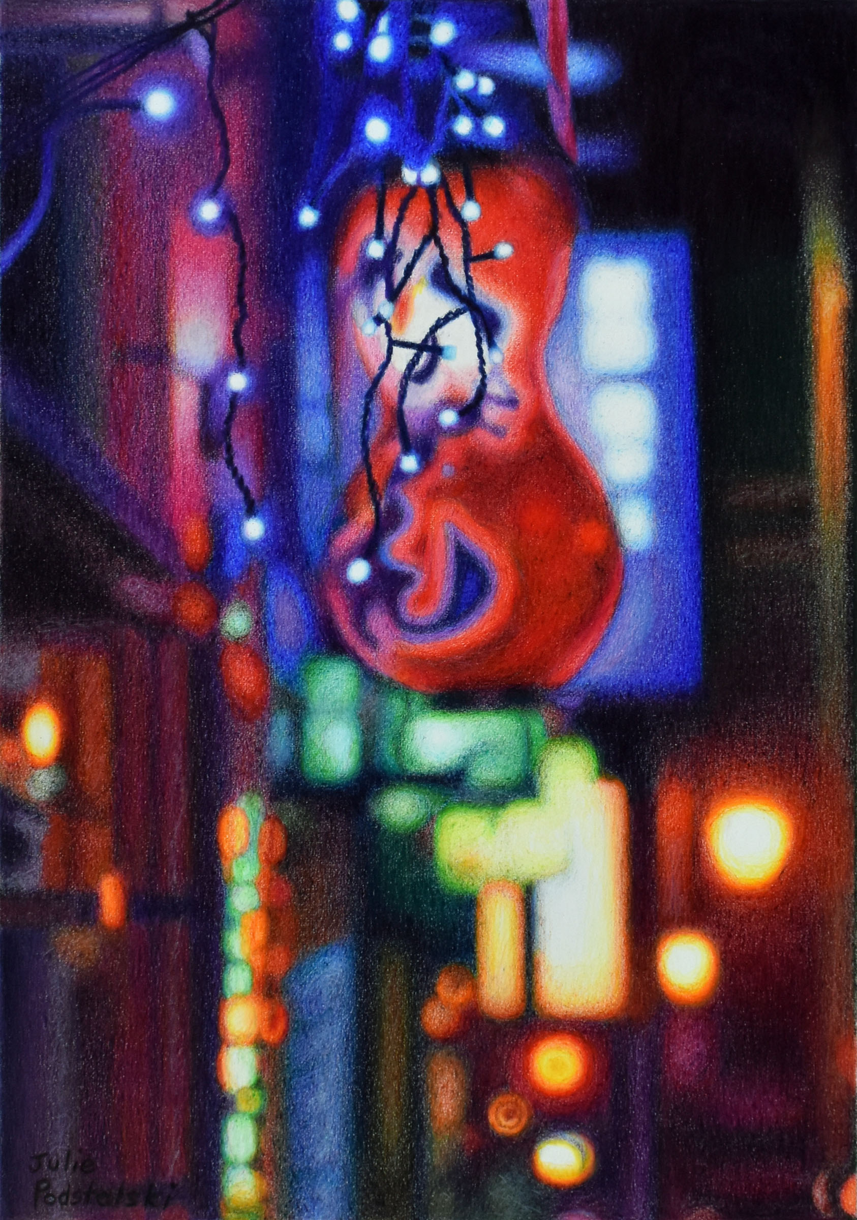
Downtown
“Downtown” Coloured pencils on Arches Aquarelle smooth paper, 30 x 21 cm. Drawn in March 2024.
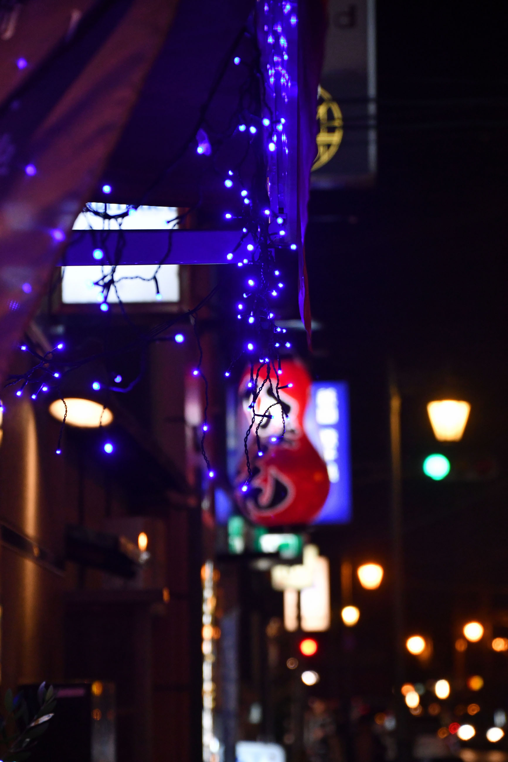
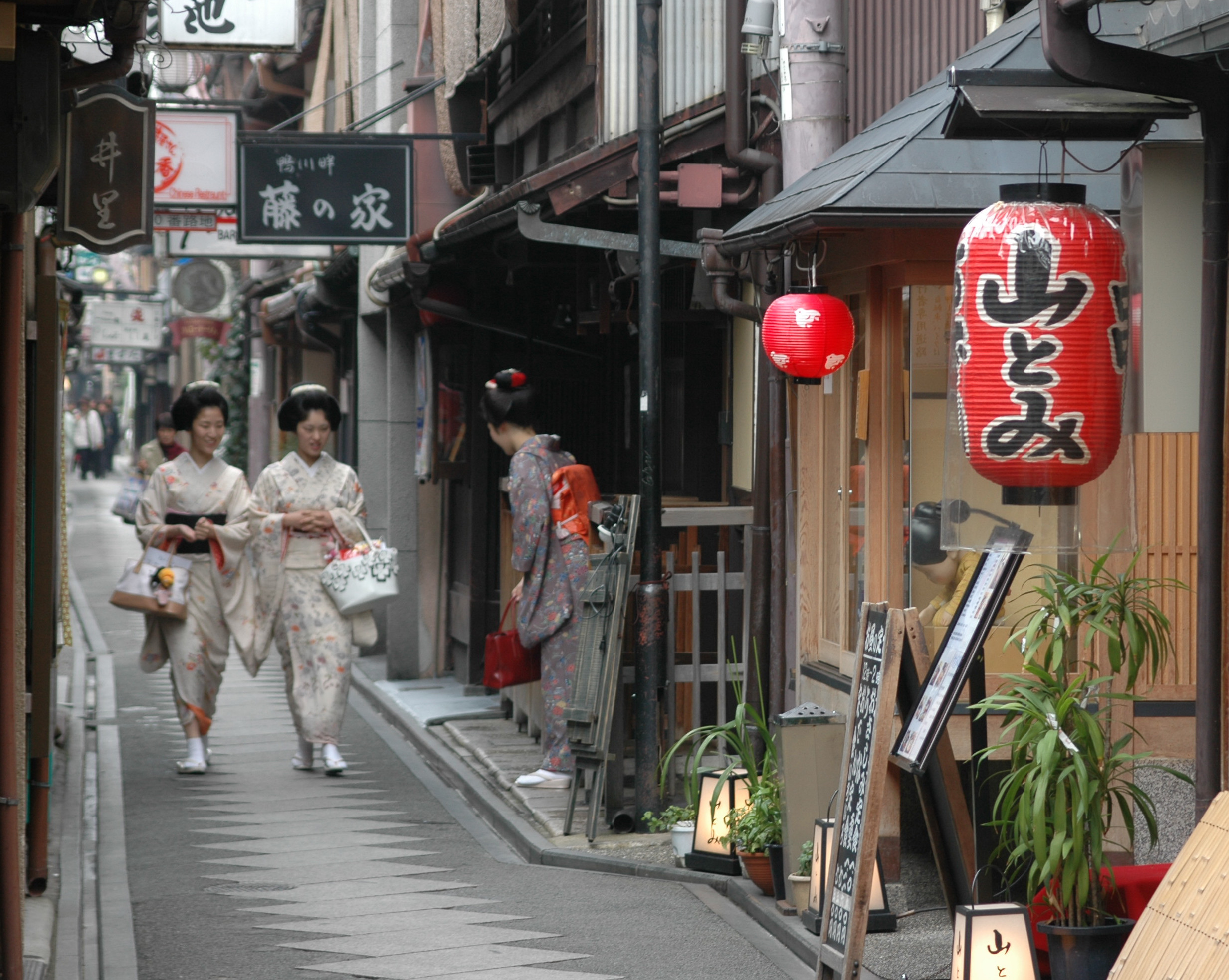
On my way to Lawson to buy takeaway dinner one evening in Kyoto, a marching band of lights caught my attention. It was headed up by blue fairy lights. A Japanese lantern fell in behind. To the rear, neon signs and street lamps formed an abstract cohort, dazzling and reflecting all the way down to Shijo-dori. What a colourful cacophony. I thought there might be a drawing in it so I took a few photos.
This is the source photo for the drawing “Downtown”.
During the last fortnight as I worked on my drawing, Petula Clark’s song “Downtown” (1964) popped into my head. The song begins…
When you're alone and life is making you lonely
You can always go downtown
When you've got worries, all the noise and the hurry
Seems to help, I know, downtown

Just listen to the music of the traffic in the city
Linger on the sidewalk where the neon signs are pretty
How can you lose?
The lights are much brighter there
You can forget all your troubles, forget all your cares

So go downtown
Things will be great when you're downtown
No finer place for sure, downtown
Everything's waiting for you.
Kyoto Twilight
“Kyoto Twilight” a drawing in Neocolor crayons and coloured pencils on Arches Aquarelle smooth, 46 x 30.5 cm. Drawn in January 2024.
It was November 2005. Having used a film camera for decades, this was my first trip to Japan with a digital camera…a Nikon D70 if I remember correctly.
I wandered around Pontocho in Kyoto just as the light was morphing from daylight into evening – which is my favourite time. Lanterns and neon lights were popping on as the sky, not to be outdone, radiated its own quiet glow. I captured the moment with my new camera.
Back in 2006 I used the same source photo for another drawing which I called “Illuminating Dusk”. Because I have always loved this composition, I wanted to have another go at it in 2024.
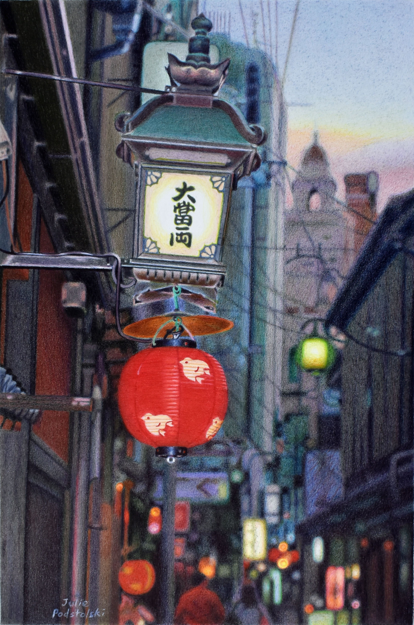
The main lantern, incidentally, has been gone for years so if you go to Kyoto you will never see this scene. I suppose that makes this drawing a little bit of history.
“Illuminating Dusk”, coloured pencils, 36 x 55.5 cm. Drawn in 2006.
My friend, Hiroo Inoue, explained about the lantern in a letter in 2006 after I showed him the drawing I’d made. He wrote, “The kanji letters say DAI TOMI RYO, literal meaning is Great Wealth Ryo Ryo. This has various meanings like monetary unit in olden times and it also means “both”. Probably Dai Tomi Ryo is the name of a Japanese restaurant. During summer time those Japanese restaurants along side of Kamogawa river, they stretch verandahs over the river. They place mats on the extended verandahs where you enjoy the sound of river flow, also enjoy Japanese dishes. Dai Tomi Ryo can offer such services during summer season”.
Rest in Peace, Hiroo-san.
Afterword: A friend commented that she thought I was brave to work twice from the same photo. I explained it this way; I saw Kyoto with fresh wide-open eyes in my early trips so I photographed things I wouldn’t even “see” when I became more familiar with the place. Now I see these early images as treasure. I bring an evolved pencil technique to the old compositions which make the finished new drawings completely different to the original drawings.
Pontocho Perfect
“Pontocho Perfect” coloured pencils, 46.5 x 27 cm. Drawn in December 2023
Pontocho, a narrow lane in downtown Kyoto, reminds me of a Venetian calle. It has the same kind of intimate claustrophobic walking space as that of a calle – squished between buildings – a tight fit. You may enter Pontocho from either Shijo Street at its southern end or Sanjo Street at its north. As soon as you turn into Pontocho you enter another world.
Pontocho is known and loved for its lively atmosphere, enormous variety of bars and restaurants – mmmm – the aromas as you pass by them! When it is quiet though, that is when you feel the spirit (and spirits) of the place.
It is also one of the five remaining hanamachi (flower towns) or geisha districts of Kyoto. These days it is so popular with tourists that one moves along in a throng (again like Venice); slowly, one vast mass made up of many bodies, edging along from north to south or south to north; bodies trying to squeeze past bodies. People stopping to read menus, people stopping to take selfies – others navigating around them. How the maiko and geiko get about, I’m not sure!
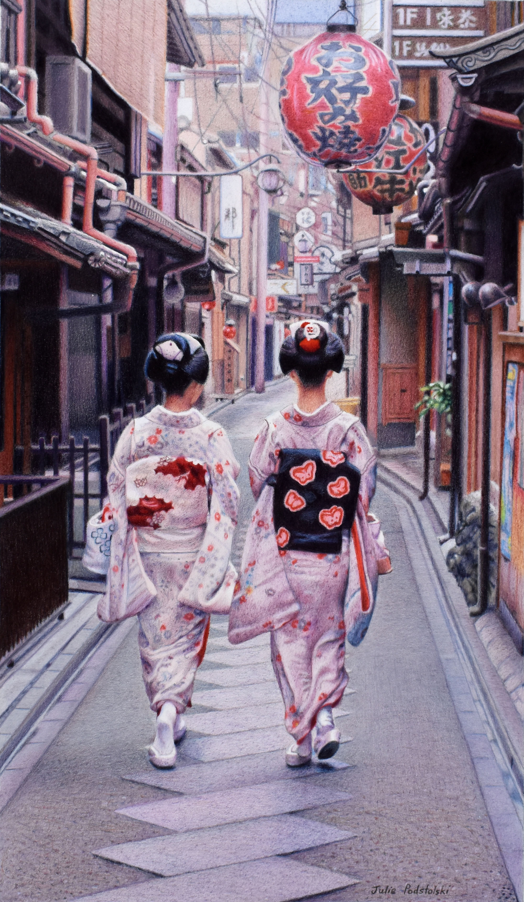
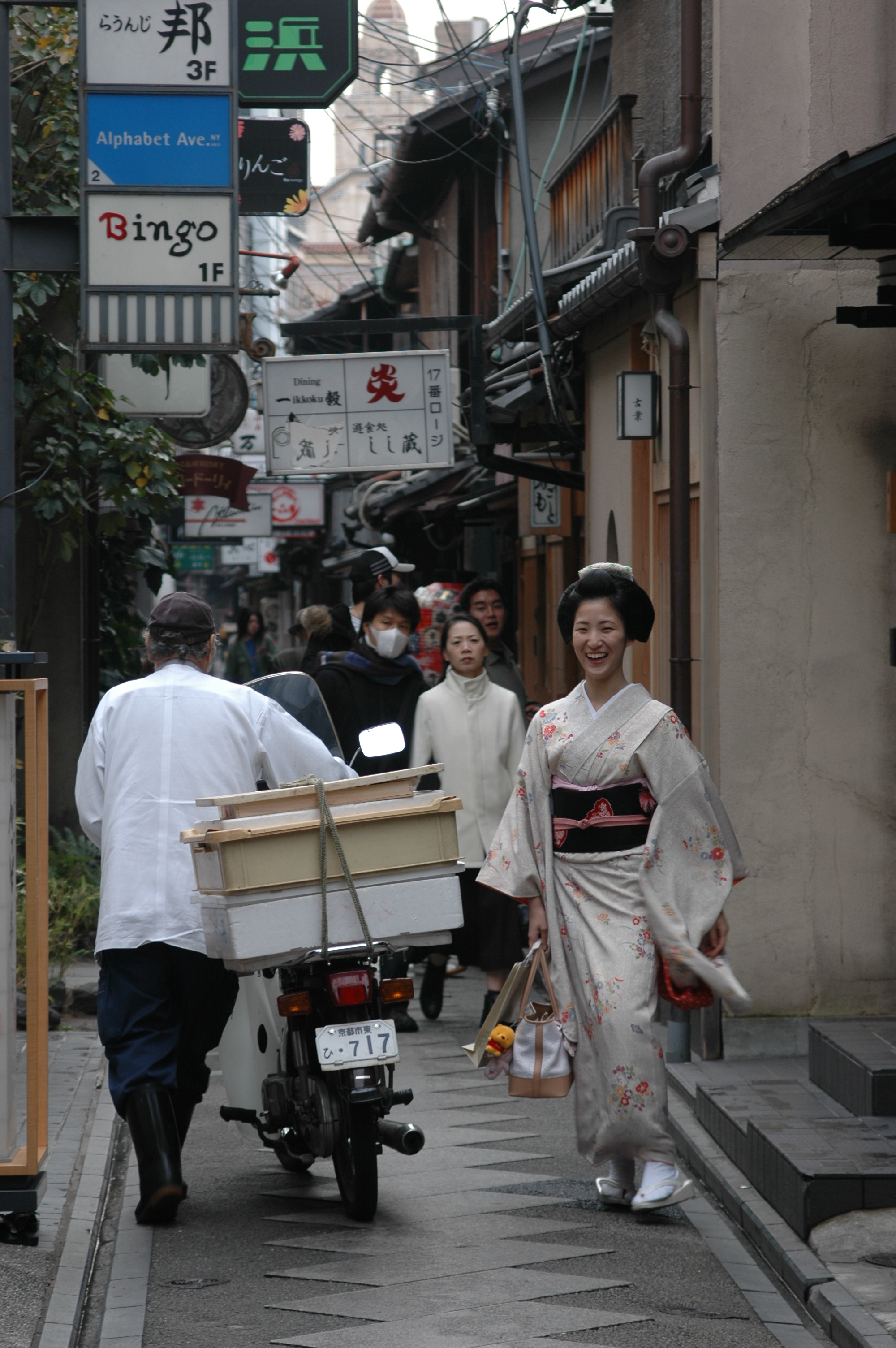
I took my own secret trip to Pontocho – here at home in Perth. I spent the whole month of December on site (in my head) – working on “Pontocho Perfect“. Not only did I space-travel, but I time-traveled, because I worked from a photo I had taken in 2005. How peaceful Pontocho was at just after 12 noon on Monday 14th November 2005. Two maiko swept past me in a flourish of floaty fabric. I delighted in their cool perfection.
“Floating in Kyoto”, 2006, was the first drawing I made of this scene. Note the different composition between the two drawings. (No lantern on the right in the new drawing.)
I don’t know who the maiko were but perhaps somebody will recognize them from the following photos.
Glowing in Kyoto
“Glowing in Kyoto” a new drawing from a 2014 photo. 34 x 34 cm. Drawn November 2023.
Time stands still – are we in the twenty-first century? Katsutomo-san approaches her okiya, key-in-hand, on a Gion street, while the always-present lanterns bob and glow.
As I continue to have an emotional pull toward lanterns, wooden tea-houses and geisha, I am unearthing my twenty year cache of Kyoto photos in order to mine them for possible new drawings. “Glowing in Kyoto”, just completed, is drawn from a photo I took on a summer afternoon in 2014.
I made a drawing from this same image back in 2014. I called it “The Art of Elegance”. You can play “spot the difference” between the two drawings.
“The Art of Elegance”, coloured pencils, 39.5 x 48 cm. Drawn in August 2014.
I find solace in subject matter such as this. The calm demeanor of elegant Katsutomo-san, the repetitive slats of wood and reassuring red lanterns are a meditation; a nostalgic world I can disappear into.
Gion Kouta
“Gion Kouta” coloured pencils on Arches Aquarelle smooth, 40 x 22.5 cm. October 2023
“Gion kouta” is the name of a hauntingly beautiful dance performed by maiko and geiko. The kouta (song) lyrics wistfully describe timeless Kyoto; its romantic changing seasons, fleeting beauty and ephemeral geisha.
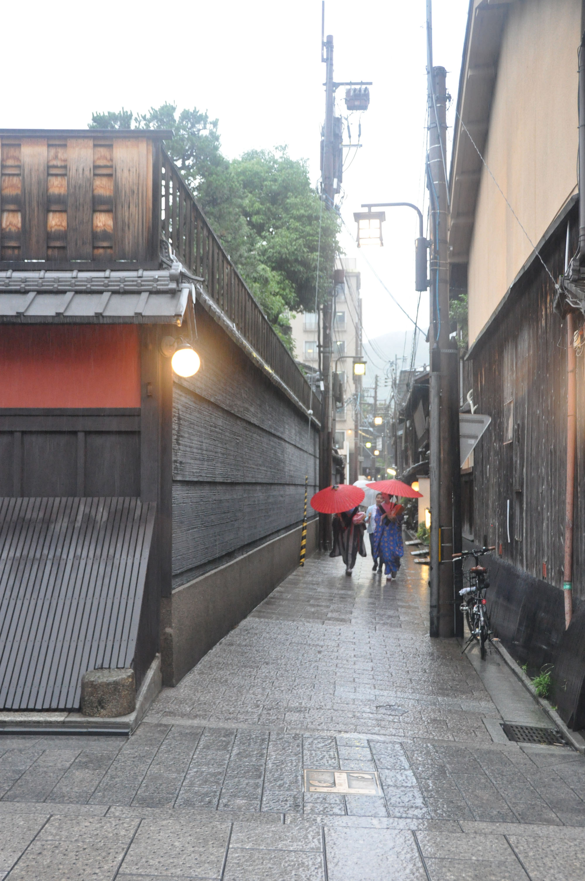
I give this drawing the title “Gion Kouta” as, to me, it has all the romance of the song. Maiko (with accompanying shikomi) hurry through drizzle under their paper wagasa (umbrellas). Ichiriki-tei (the most famous tea-house in all of Japan) is on the left; lanterns and street lamps glow and reflect, and in the distance loom the eastern hills – Higashiyama.
Even the hotel where I stay is in this drawing. APA Gion Hotel is the pinkish multi-level building behind on the left. I’ll be there again in a couple of weeks’ time.
I took the source photo for this drawing in June 2016. It took me seven years to figure out how to bring about the drawing I had in mind! Once I began, the drawing drew itself quite effortlessly – and came to a resolution ‘just like that’ without angst.
This is the original source photo.
Click on the link below to hear the beautiful and somewhat melancholy tune of “Gion Kouta”.
A Walk in Miyagawa
“A Walk in Miyagawa” coloured pencils, 37 x 25 cm. May 2023
With the latest art exhibition “Home & Heart – local love stories” behind me, I decide to indulge myself with a Kyoto drawing – just for the sheer love of it.
Miyagawa is one of Kyoto’s five geisha districts. I was last there in November 2019 and this drawing is from a photo I took during that trip.
I like spending time in Miyagawa as it is quiet. Just ten minutes’ walk north, the better-known geisha district of Gion is heaving with tourists eagerly (and sometimes brutally) trying to intercept maiko and geiko (geisha) for photos.
Below are three older drawings from Miyagawa; each portrays a rear view. I love drawing the kimono ensemble from behind, while pictorially, a retreating figure guides the viewer into the scene.
“Last Night I Dreamed of Kyoto” is the same street on the same night but treated differently. Drawn in 2021.“Surprise!” – two maiko were ambushed by a group of cameramen as they turned a corner. Drawn in 2011.“Step by Step” – a young maiko and an old lady represent the passage of time. Drawn in 2014.
Timeless Miyagawa – as I draw the scene, so I am also drawn in.
A Late Night Conversation
For several days I have been “in training”. “Each night I stayed up as late as I could and each morning attempted to sleep in. My goal was to adjust my body-clock so that I wouldn’t only be awake until midnight on Wednesday 6th April but also lucid, lively and with a reasonable vocabulary at my disposal.
I had been invited by Ann Kullberg to be her guest on a webcast LIVE from America. West Australian time is 15 hours ahead of U.S. Pacific time. Ouch – hence my “in training” sessions!
Everything worked out perfectly. I had a great time in conversation with Ann and midnight came around as rapidly as it surely had for Cinderalla on another night long ago.
While people tuned in from various parts of America to see the webcast live, in my region you were all in bed fast asleep. Now that you are up and about – here it is.
While some of my artworks are seen on the webcast you can see hundreds of them on my website – from the 1970s to now. https://juliepodstolski.com
Last Night I Dreamed of Kyoto
“Last Night I Dreamed of Kyoto” 28 x 20 cm. October 2021
I have been self-disciplined in sticking to local subject matter in 2021. I tell myself “YOU ARE HERE”. I am at my drawing easel in North Coogee, Western Australia. But at night when I sleep there are neither domestic nor international borders. In my dream state I am a free agent. Quite regularly my dreams return me to Japan and if they are of the anxious variety, more often than not, my camera is lost!
In this drawing the maiko is not the bright centre of attention. She is fast disappearing as she smoothly moves away through lanterns, neon and darkness. Beyond reach and dream-like, perhaps a dim figment of nocturnal imagination.
———————————————————————————————————————————-
Below is the drawing at various stages. I experimented by blending the undercoat of Neocolor II pastel with a blender pencil BEFORE putting on coloured pencil. Doing this altered the paper – making it a smoother surface to work on. (I often use blender over the top of coloured pencils but this was the first time I put it underneath.) I liked the feel of working pencils over the blended Neocolors but I’m not sure the end result is different from what it might have been had I done things in their usual order.
Neocolor II water-soluble pastels (without water) undercoat.Neocolor II undercoat lightly covered over with Caran d’Ache Pencil BlenderLuminance 6901 coloured pencils beginning to go over Neocolor + blender.The layers of coloured pencils spread across the work.“Last Night I Dreamed of Kyoto” finished.