A site to share my drawings, paintings, photographs and thoughts.
Category Archives: Venice
A Late Night Conversation
For several days I have been “in training”. “Each night I stayed up as late as I could and each morning attempted to sleep in. My goal was to adjust my body-clock so that I wouldn’t only be awake until midnight on Wednesday 6th April but also lucid, lively and with a reasonable vocabulary at my disposal.
I had been invited by Ann Kullberg to be her guest on a webcast LIVE from America. West Australian time is 15 hours ahead of U.S. Pacific time. Ouch – hence my “in training” sessions!
Everything worked out perfectly. I had a great time in conversation with Ann and midnight came around as rapidly as it surely had for Cinderalla on another night long ago.
While people tuned in from various parts of America to see the webcast live, in my region you were all in bed fast asleep. Now that you are up and about – here it is.
While some of my artworks are seen on the webcast you can see hundreds of them on my website – from the 1970s to now. https://juliepodstolski.com
Pictures from Italy
Nearly everybody in the world who reads my blog was unable to visit the art exhibition which opened on April 8th 2021 featuring 24 of my drawings and 22 clay sculptures by Robyn Varpins. The world is vast. I live in the most isolated city within it – Perth, Western Australia.
So here is the collection of drawings which took 28 months to put together. I am showing them in the order in which they were drawn along with a brief description of each.
Early One Morning 07:50 on a November Saturday in Cannaregio. It is my first morning discovering Venice. 35 x 28 cm. January 2019. SOLD
A Room with a View I am contemplating a nocturnal view from a window of our Cannaregio apartment. 31.5 x 25 cm. January 2019. SOLD
The Remains of the Day Looking across the Venetian lagoon to Punta della Dogana and Basilica di Santa Maria della Salute as the sun descends in the west. 36.5 x 31 cm. February 2019. SOLD
Silent Night All is quiet except for lapping water, a soft breeze, and footfalls in Dorsoduro late at night. 32.5 x 29 cm. May 2019. SOLD
Deep in Castello One may feel submerged within the narrow vertical spaces of Venice, as I do, deep in Castello. 31 x 26 cm. August 2019. SOLD
Winter Rain Unrelenting winter rain falls over Venice as the tide stealthily rises. 24 x 20 cm. October 2019.
A View from Lido A hazy view from Lido, looking back across the lagoon to San Giorgio Maggiore. 39.5 x 32 cm. November 2019.
Eventide San Giorgio Maggiore floats in the distance during The Feast of All Souls, November 2nd. 34.5 x 42.5 cm. December 2019. SOLD
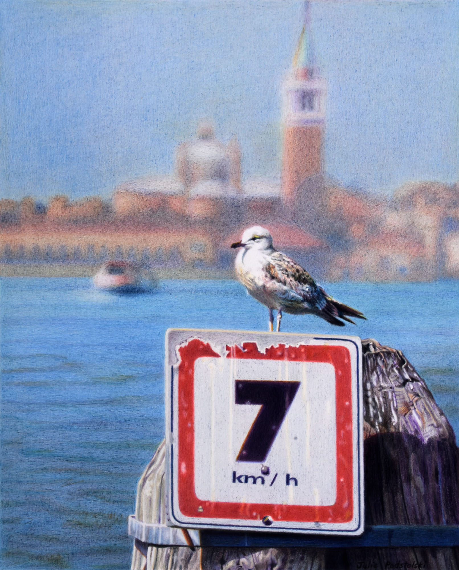
Look Out At a lookout on Palatine Hill a yellow legged gull poses under a thundery sky. 28.5 x 30 cm. December 2019. SOLD
Most Serene A vaporetto emerges out of the dissipating sea fog early on a spring morning. 33.5 x 48.5 cm. January 2020. SOLD
Ascension The dome of Santa Maria della Salute glows above the Grand Canal on a heaven-sent evening. 36.5 x 36.5 cm. February 2020. SOLD
Quiet Time On Lido, an obliging yellow legged gull poses before a panoramic view. 33.5 x 53.3 cm. April 2020. SOLD
The Hospital Cat Within the courtyard of Ospedale Civile in Venice lives a small community of cared-for cats. 30.5 x 27 cm. June 2020.
Composition with Cat An alert cat sits within framework at Ospedale Civile, Venice, bringing to my mind a Piet Mondrian composition. 32 x 29 cm. June 2020.
All the World’s a Stage “All the world’s a stage…” wrote William Shakespeare. On Palatine Hill the stage belongs to a yellow legged gull. 32.5 x 48.5 cm. August 2020. SOLD
Another Time Chamonix is an alpine resort in the French Alps near both Switzerland and Italy. On a balmy evening, tourists saunter. 25 x 31 cm. September 2020. SOLD
Good Vibrations It is early evening on lively via Fiori Oscuri in the Brera district of Milan. Lights, colours, action – “I’m picking up good vibrations”. 35 x 29 cm. October 2020. SOLD
Cornered A threat with style! This piece of street art commands attention on a corner wall in Milan. 28 x 31 cm. October 2020. SOLD
Summer Rain A summer thunderstorm causes colours to run in Verona. 24 x 21 cm. November 2020. SOLD
An Autumn Feast The Cathedral of Florence hovers above the autumnal trees of Giardino di Boboli. 25.5 x 28 cm. November 2020. SOLD
An Italian Dream It is a fine autumn morning in spectacular Vernazza. I am dazzled by this fishing village on the Ligurian coast. 41 x 29 cm. December 2020. SOLD
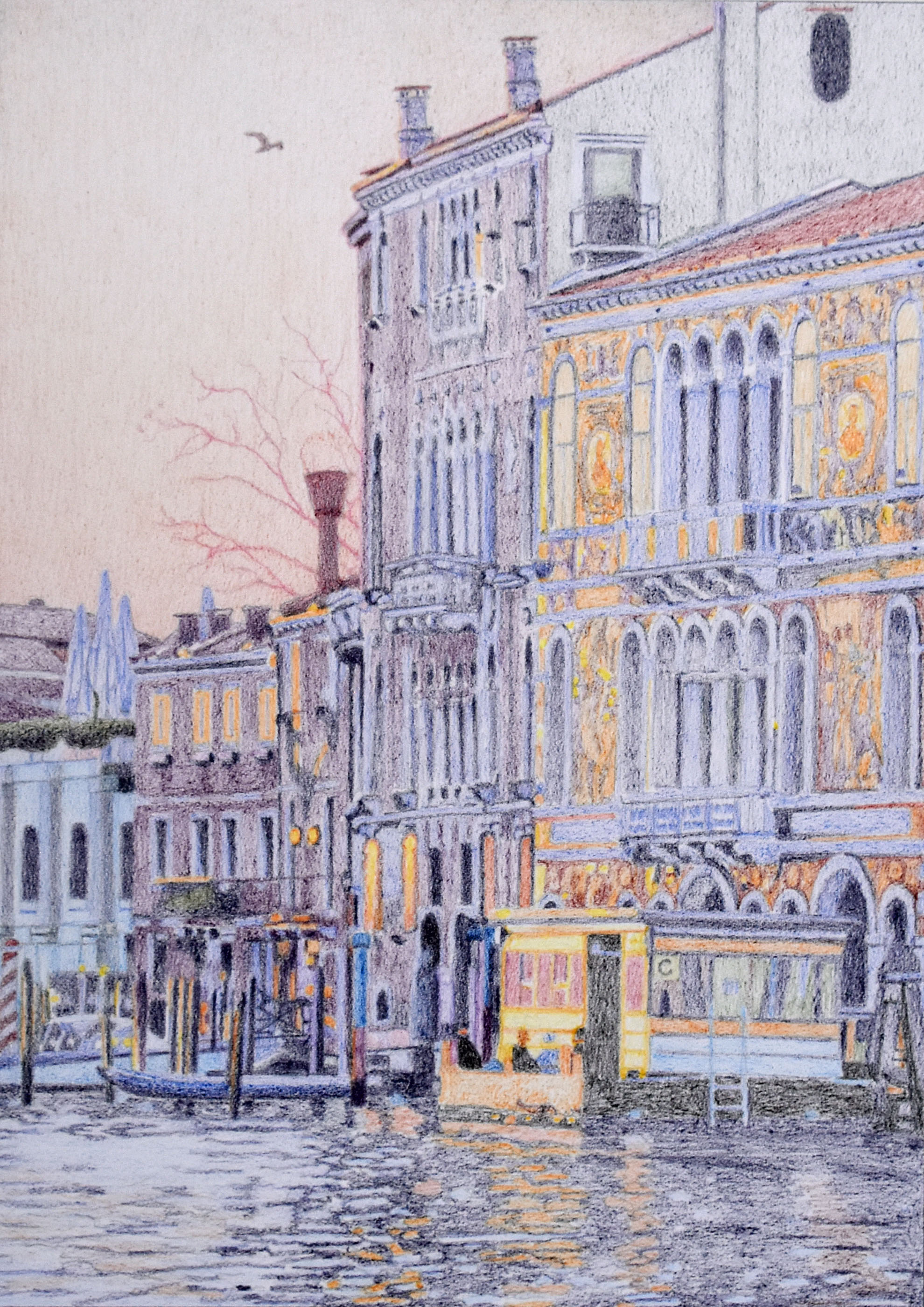
Morning has Broken The palazzi and the Accademia vaporetto stop reflect the rising sun from their east-facing surfaces. 40.5 x 29 cm. January 2021. SOLD
Wet Verona A summer evening thunderstorm erupts over Verona’s pedestrians. 21.5 x 25 cm. February 2021.
Europe Endless A small station somewhere in Europe (Chamonix) invites the question, “Where next?” 23.5 x 20 cm. February 2021.
…and the answer to the question “where next?” is Fremantle (home). But that is another story and possibly another exhibition in 2023….
Robyn and Julie
To view the sculptures of Robyn Varpins, see her website here
And here is a link to the article in The West Australian Newspaper by Journalist Will Yeoman on “An Italian Dream”.
This was opening night on 8 April 2021.
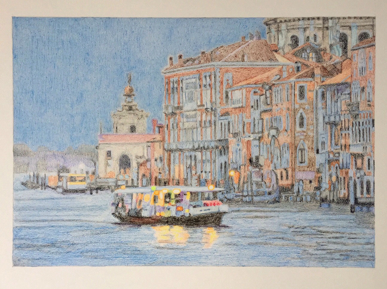
Morning has Broken
“Morning has Broken” January 2021 40.5 x 29 cm.
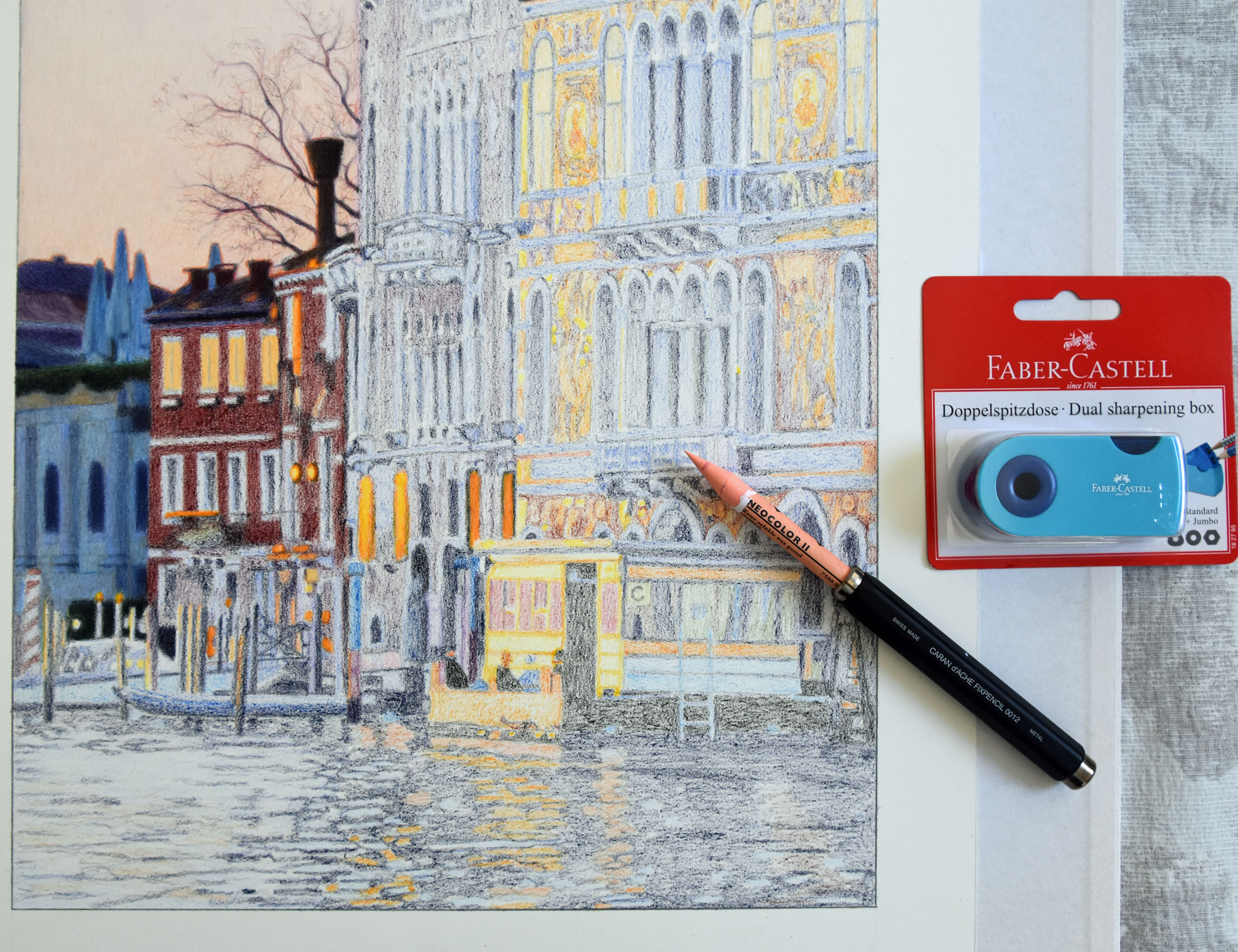
I regularly write about a method I’ve developed of putting an undercoat of Neocolor (wax pastel) onto my paper before I build colour over it with Luminance coloured pencils. I’ve used the Neocolor/Luminance partnership for this work.
One doesn’t absolutely need Neocolor when working with coloured pencils. Here is the same subject; sunrise reflecting off buildings on the Grand Canal, which I drew two years ago with Luminance coloured pencils alone.
“Sunrise Reflected” drawn in June 2019
I wanted to tackle this subject again so I decided to give myself a different experience from the first time by adding Neocolor. I ask myself each time I’m ready to begin a new work, “Am I in the mood to use Neocolor or am I not?”.
Incidentally you may notice the same seagull in both drawings. The bird is actually in the source photo for my latest drawing “Morning has Broken” however I wanted him in the first drawing “Sunrise Reflected” so I borrowed him.
Here is “Morning has Broken” in stages:
Undercoat in Neocolor finished.Starting to work the Luminance over the top from the left.As I move across I continually adjust all the earlier sections.The building on the right is in the process of being worked on.“Morning has Broken” January 2021
At every stage I fix things up, trying to get perspective right plus have windows and columns lining up as best I can. One thing about Venetian architecture is that it is warped and wonky. This gives me a bit of leeway. The unexpected sags and lumps may be the buildings themselves as opposed to this artist’s poor skills. Mayhap – this is a word I often say in my head – a mixture of maybe and perhaps.
During this week, over forty years of work comprising more than 550 paintings and drawings in 15 categories, was migrated over from my old website to a brand new 2021 website. I’d love you to take a look. https://juliepodstolski.com/
Composition with Cat
“Composition with Cat” drawn in June 2020 with Luminance coloured pencils. 32 x 29 cm.
Serendipity! Three days before I took the photo which became my source for “Composition with Cat” Alicia and I had already visited the cat community at Ospedale Civile in Venice. I showed the image below of Alicia (middle daughter) talking to the cats in my recent blog post “The Hospital Cat“.
Alicia is stroking the SAME CAT as in my drawing!
I had already begun drawing “Composition with Cat” when I happened to look back at this photo of Alicia with the cats. What a surprise I had to see that my current subject was THE CAT Alicia was stroking. From then it was a double delight to work on this little puss, knowing what an affectionate character he was.
In the pose for my drawing he has intense concentration on his face. Perhaps he was eyeing a Venetian pigeon in the hospital grounds!
This composition brings to my mind the spacial divisions within the paintings of Mondrian. (Piet Mondrian – Dutch Artist, 1872-1944.) His paintings were pure abstraction. Like him (but not like him) I am working with contrast of proportion and contrast of hue in a pure realism way. He used to call his paintings either “Composition in…” or “Composition with…” hence the title I have given my drawing – “Composition with Cat”. I am doffing my hat to Mondrian.
Make Your Own Mondrian – A Modern Art Puzzle. We bought this at Museum of Contemporary Art in Sydney.
Initial under-layer of colour right back at the beginning of the work.
The Hospital Cat
“The Hospital Cat” drawn with coloured pencils on Arches Aquarelle smooth. 30.5 x 27 cm. June 2020.
On our first afternoon in Venice on 2 November 2018 my daughter and I wander into a grand looking edifice. We don’t know that we are entering the Ospedale Civile or Public Hospital. Through automatic doors and into a courtyard we walk. What do we discover? A cat community!
A courtyard within the grounds of Ospedale Civile, Venice.
The automatic doors appear to be operational for cats as well as humans. Even though the (slightly spooky) corridor is empty in the photo below, on my second visit I see a cat padding nonchalantly along a section of it, exiting at the door leading to one of the courtyards.
I take a photo of the entrance to the cat house. The cat in the porch looks like the cat in my drawing. If it isn’t the same individual surely it must be from the same family.
Though the tabby in my drawing looks rather aloof with a “Why are you bothering me?” expression (typical of felines) the cat community is welcoming and affectionate as the following photos affirm.
Alicia and cats.
Julie and cats.
If it hadn’t been for Covid-19 I would have returned to Venice in March this year and come away with a whole new batch of source photos to draw from. I would have been spoiled for choice with 2020 material and would almost certainly have overlooked making a drawing from the Venetian hospital visit 17 months ago. The 2020 world health situation is forcing me to re-evaluate the photo-treasure I already have.
I thank all the brave compassionate people who work in hospitals, especially in the time of a pandemic. And thank you Venetian Hospital Cats. I saw visitors (probably their loved ones were patients) sitting on outdoor benches beside you, comforted by your purring presence.
Quiet Time
“Quiet Time” is a drawing in coloured pencils and Neocolor II wax pastels. 33.5 x 53.3 cm. April 2020.
In the Covid-19 time in which we are living, local cafés and restaurants are shut – except for takeaways. In Fremantle (Western Australia) Matthew and I line up to buy coffees then take them to some isolated spot or other overlooking the port.
As we sit on canvas chairs facing sky and sea we talk or simply listen to water lapping, breezes and bird calls. More often than not a seagull comes to check on whether we have some food to share.
I am describing a daily ritual during March/April 2020. However my latest drawing is from when we visited Lido in March 2019. What were we doing on Lido? … quietly regarding Venice from across the lagoon while being checked on by a seagull!
I’ve spent the last four weeks working on “Quiet Time“. I could have responded to the ‘new normal’ by drawing something dark and ominous – suiting our collective pessimistic mood. However I decided on an uplifting subject from which I could perhaps find comfort. What could be more reassuring than sky, water and seagull?
At first while working on this piece I feel disconnected and unable to concentrate, just as I feel disconnected (in shock) to the dystopian daily news. I force myself to keep drawing. (How does one get one’s head around a pandemic?) In the end, the serenity of the subject reaches out to me. The drawing and I eventually connect.
Even though the composition was sourced from 12 months ago in Northern Italy, it feels entirely relevant to a part of bubble life now, especially to that hour each day when, sitting before local waters with coffees, Matthew and I share our isolation quiet time.
“An Italian Dream” (from nearly the same position) was drawn in October 2019.
Ascension
“Ascension” Wax pastels and coloured pencils, 36.5 x 36.5 cm. February 2020
Yes, all the complaints are true; too many tourists, floods, cruise ships, corruption, over-commercialization – not to mention that Venice is actually sinking. It is mortal, as is everything physical.
But look past all that, to the beauty, and the spirit. Her soul soars. My soul soars when I am there – enraptured by her environment.
Close to Heaven.
In February 2020 I expected to be returning to Venice within a month. Covid-19 changed that and a couple of weeks after I finished “Ascension” we cancelled our European trip.
Most Serene
“Most Serene” Neocolor 2 wax pastels and Luminance pencils. 33.5 x 48.5 cm. January 2020.
On my final morning in Venice I plan to sleep in, having risen before daybreak for the previous six days in a row.
In our dark bedroom at 5 o clock, a mosquito is sent to wake me up. Eventually this insistent messenger’s whine is enough to toss me out of the room into a cold foggy dawn.
I cross the Accademia bridge without a particular plan. As I wonder which way to wander, a vaporetto (little steamer) materializes through the mist. As she glides nearer she brings the scene to life – aglow, awake and at work (as am I) in a still-slumbering city.
Venice – La Serenissima – Most Serene
Postscript: What a funny thing that something as irritating as a mosquito could lead to a serenity. There must be a moral to this story. Happy endings may result from perceived misfortune.
Notes on colour-building with Neocolor 2 and Luminance are in my previous post Perfect Partners
Neocolor 2 undercoat
Perfect Partners: Neocolor and Luminance
Recently I have been sharing a method in Facebook coloured pencil groups which has piqued the interest of some of my peers; therefore, I have decided to write a post about it.
My method is to use Neocolor 2; a water soluble wax pastel by Caran d’Ache (I use it without water) as undercoat for coloured pencil drawings.
Putting Neocolor onto the paper before coloured pencils are applied speeds up the process of the drawing – which is especially good if I am working on a large picture. (The drawing shown here is 33.5 x 48.5 cm.) Anyone who uses coloured pencils alone to render big areas like sky or still water knows how tedious it is. Neocolor makes the process faster and more pleasurable.
The texture of Neocolor 2 makes a welcoming cushion-like base for coloured pencil to relax into. The pencil glides over Neocolor so much more readily than it glides over virgin paper.
I find that complicated areas (such as Venetian palace facades) cannot help but be simplified when the initial layer is put on with Neocolor. You can’t be too fussy with this medium because it is never super-sharp. (I use a knife to sharpen the pastel but even at its sharpest, it is kind of blunt.) Therefore it attunes my brain to the main shapes as opposed to fiddly tiny details.
I use very light pressure when putting Neocolor on. It is barely there – and yet it makes SUCH a difference to the surface texture.
Work in progress 1: undercoat of Neocolor 2 before any coloured pencil is applied.
Because I don’t like holding a crayon-length instrument, I use a Fixpencil 0012 (also by Caran d’Ache) to hold it with. I find this longer length much more comfortable for my hand and it gives me added control.
Applying Neocolor 2 (held inside a Fixpencil 0012).
If you’ve read other posts of mine, you’ll know that Luminance is my number one pencil. However in the photo below you’ll see I’m blending using a Derwent Blender. This blender is hard and dry. There’s enough wax already in the Neocolor/Luminance mix. It doesn’t need added wax in the form of a wax-based blender, so the raspy dry Derwent blender makes the perfect tool. Once I’ve blended, that isn’t the end of it. I can carry on adding more colour over the top; no problem.
Enter the Derwent Blender
The final image shows where I’m up to currently with the drawing. In my opinion, the partnership of Neocolor with coloured pencil gives a soft painterly aesthetic which, to me, is delicious.
Work in Progress – as it was on 13th January 2020.Work in progress – as it was on 18th January 2020
Postscript: The drawing is finished on 24th January, 2020. It is called “Most Serene”.
Here is a step-by-step exercise to show my impressionistic technique using Neocolor and Luminance. I originally created the piece “Daydream” for Ann Kullberg’s COLOR Magazine. It is featured in the November 2020 issue. You can click on the images to enlarge them.
Source photo for “Daydream” exerciseLine drawing for “Daydream” exercise.
Working from a cropped photo I took of a maiko (apprentice geisha) I trace minimal lines onto a piece of Arches Aquarelle smooth paper, 9 x 7 inches. The lines are arbitrary for when everything is blurry where exactly does one draw the line? With no sharp tonal boundaries and everything merging the graphite guide lines may only be approximate.
Once I have my graphite lines on the paper I begin the undercoat process. This can be done purely with coloured pencils but I like to begin with Caran d’Ache Neocolor wax pastels. Neocolor’s waxy texture makes a nice surface for coloured pencils to go over. Because a Neocolor stick is a fairly blunt instrument it encourages me to work in a loose manner. As I put Neocolor on I simultaneously erase the graphite lines. I work with such light pressure that if I put a colour in the wrong place I can lift most of it off with an eraser.
Once the page is filled with Neocolor I bring in the coloured pencils. At this early stage I am working them over the Neocolor gradually intensifying the values. I am using light to light-medium pressure only. I still see this as a continuation of undercoat even though I’m now using pencils. My pencil work is reasonably free and non-fussy as I begin to build tone over the page. I lay white pencil over the pale pink kimono (but nowhere else in the drawing) because I want the maiko eventually to stand out from the rest of the drawing. The application of white will give her kimono a glow. I use the pencils in a vigorous way letting all manner of expressive marks show.
From now on it is a matter of layer-building. I mostly work with small vertical strokes however I use other directional strokes too. For instance on the path you can see that my strokes are diagonal – in tune with the perspective. I also use an all-over-the-place scribble which helps the diffused look. My scribble marks are gossamer-light however; no heavy-handed scribbling. (What is scribble if not a type of mark-making?) Stroke direction can also add to a feeling of movement. I want the maiko to look like she is rushing away from me so my directional strokes help to create that effect.
To create blurriness there is a lot of colour overlapping taking place. For example I push the pink of the kimono into the grey path and push the grey of the path into the pink kimono. Throughout the drawing I am pushing and pulling colours which constantly merges the boundaries between areas and objects.
Because this kind of drawing comes together from a distance I only sit down to work on it in the early stages. I work in an expressive way with my whole self. That is, I work from one end of the room to the other. The drawing stands on an easel. I walk up to it and away from it, putting a mark here, going away to check how it looks, going back to adjust, stepping back again to see from afar. It is action work. And as I go I continually adjust and fine-tune until at some point I think I am done.
“Daydream” is complete. What were my aims? I was seeking a mood, an impression, an atmosphere, in this case perhaps a sense of walking speed as well. The source photo was my jumping off point – or you could say it was my way back to the memory of that Kyoto afternoon.
An Italian Dream – technical note
How the drawing looked as a work in progress.
In “An Italian Dream” I wanted the colours in the foreground to be the most deeply saturated parts of the picture, being closest to the viewer. So I put Neocolor II wax pastels down as undercoat for this water/boat area. The sky, hills and buildings have no Neocolor underneath. They are rendered with coloured pencils only. Having wax pastels for the pencils to work into and over makes for a finish of delicious intensity.
“An Italian Dream” December 2020
How do I manage to do fairly detailed work at the undercoat stage with Neocolor? The answer is that I sharpen my Neocolors using the Faber Castell dual pencil sharpener. The larger of the openings of the dual sharpener fits Neocolor perfectly.
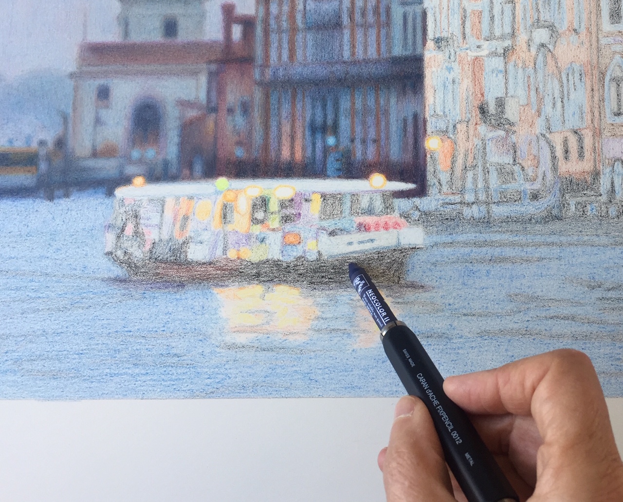
Currently (January 2021) I am working on a drawing of sunrise on the Grand Canal.
Undercoat stage with Neocolor II completed. Ready to begin with Luminance.
When you see the Luminance colour go over the top of the Neocolor undercoat, you can appreciate by comparing the coloured pencil with the pastel areas how lightly I use the Neocolor. Neocolor maps in the shapes with the lightest pressure. The Luminance going over the top does 95% of the work. Despite the light pressure of the Neocolor, its presence makes a difference – enriching the work as a whole.
Luminance making its presence felt on the left of the work.
The drawing continues – Luminance over Neocolor gradually moving from left to right across the buildings. Also I adjust as I go, for instance, intensifying the glow in the sky.
In the next image I am working on the building on the right. These are not its final colours; rather, it is perhaps half-way completed.
Finally, the finished piece, “Morning has Broken”. Ready for my April 2021 exhibition “An Italian Dream”. (You can have a sneak preview of all the pieces which will be exhibited HERE.)
“Morning has Broken” January 2021
February 2022: I photographed another drawing in stages. Here are six stages of “Box Seat” .
Stage 1: Neocolor undercoat covering everything except bird.Stage 2: Bird undercoated with coloured pencil only. Stage 3: Starting to build up layers with pencils on lower part of drawing.Stage 4: Coloured pencil layers moving upwards and outwards over undercoated Neocolor.Stage 5: The picture is at a stage now where I decide to begin on the box seat and bird.“Box Seat” the finished drawing. Because the bird is drawn using coloured pencils only (no Neocolor undercoat) he stands out from the rest of the picture. Also I used my technique of Undercover White to make the bird glow.
Eventide
“Eventide” Neocolor 2 and coloured pencils. 34.5 x 42.5 cm. December 2019.
Here we are, our first evening in Venice. We emerge from a labyrinth of claustrophobic lanes to the grand promenade of Molo. Before us is a floating world which takes our breath away.
Love at first sight.
“Eventide” is from that moment of euphoric discovery.
Resting gondolas bob on the high tide, San Giorgio Maggiore perches erect in the distance. Elements of Venice are juxtaposed and all is enveloped in blue.
It is November 2nd. All Souls Day.
(June 2021: “Eventide” is now in the permanent collection of St John of God Hospital, Perth, Western Australia)