Perfect Partners: Neocolor and Luminance
Recently I have been sharing a method in Facebook coloured pencil groups which has piqued the interest of some of my peers; therefore, I have decided to write a post about it.
My method is to use Neocolor 2; a water soluble wax pastel by Caran d’Ache (I use it without water) as undercoat for coloured pencil drawings.
Putting Neocolor onto the paper before coloured pencils are applied speeds up the process of the drawing – which is especially good if I am working on a large picture. (The drawing shown here is 33.5 x 48.5 cm.) Anyone who uses coloured pencils alone to render big areas like sky or still water knows how tedious it is. Neocolor makes the process faster and more pleasurable.
The texture of Neocolor 2 makes a welcoming cushion-like base for coloured pencil to relax into. The pencil glides over Neocolor so much more readily than it glides over virgin paper.
I find that complicated areas (such as Venetian palace facades) cannot help but be simplified when the initial layer is put on with Neocolor. You can’t be too fussy with this medium because it is never super-sharp. (I use a knife to sharpen the pastel but even at its sharpest, it is kind of blunt.) Therefore it attunes my brain to the main shapes as opposed to fiddly tiny details.
I use very light pressure when putting Neocolor on. It is barely there – and yet it makes SUCH a difference to the surface texture.
Because I don’t like holding a crayon-length instrument, I use a Fixpencil 0012 (also by Caran d’Ache) to hold it with. I find this longer length much more comfortable for my hand and it gives me added control.
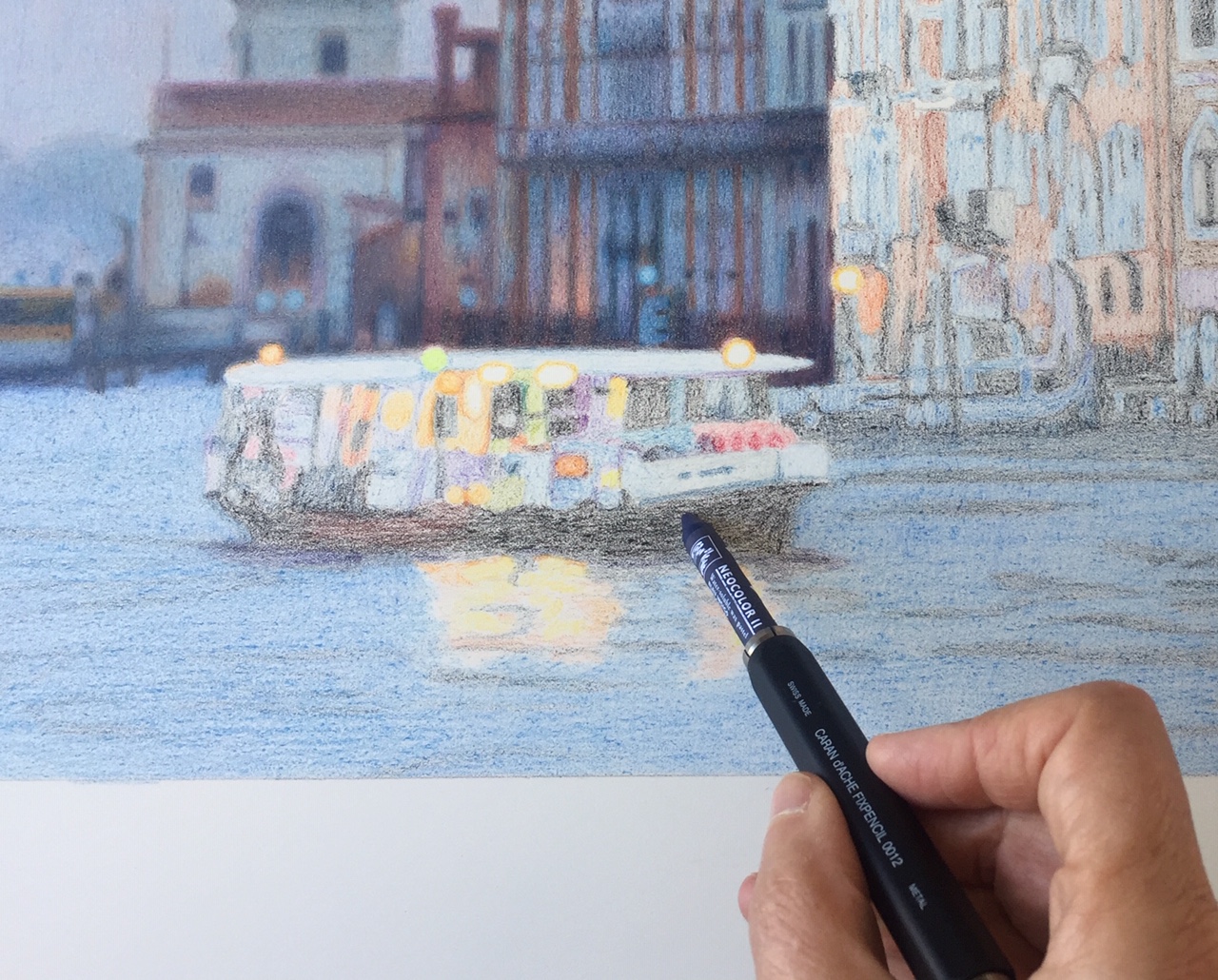
If you’ve read other posts of mine, you’ll know that Luminance is my number one pencil. However in the photo below you’ll see I’m blending using a Derwent Blender. This blender is hard and dry. There’s enough wax already in the Neocolor/Luminance mix. It doesn’t need added wax in the form of a wax-based blender, so the raspy dry Derwent blender makes the perfect tool. Once I’ve blended, that isn’t the end of it. I can carry on adding more colour over the top; no problem.

The final image shows where I’m up to currently with the drawing. In my opinion, the partnership of Neocolor with coloured pencil gives a soft painterly aesthetic which, to me, is delicious.


Postscript: The drawing is finished on 24th January, 2020. It is called “Most Serene”.

See also Art Materials page
See also Brush and Pencil post
Here is a step-by-step exercise to show my impressionistic technique using Neocolor and Luminance. I originally created the piece “Daydream” for Ann Kullberg’s COLOR Magazine. It is featured in the November 2020 issue. You can click on the images to enlarge them.


Working from a cropped photo I took of a maiko (apprentice geisha) I trace minimal lines onto a piece of Arches Aquarelle smooth paper, 9 x 7 inches. The lines are arbitrary for when everything is blurry where exactly does one draw the line? With no sharp tonal boundaries and everything merging the graphite guide lines may only be approximate.


Once I have my graphite lines on the paper I begin the undercoat process. This can be done purely with coloured pencils but I like to begin with Caran d’Ache Neocolor wax pastels. Neocolor’s waxy texture makes a nice surface for coloured pencils to go over. Because a Neocolor stick is a fairly blunt instrument it encourages me to work in a loose manner. As I put Neocolor on I simultaneously erase the graphite lines. I work with such light pressure that if I put a colour in the wrong place I can lift most of it off with an eraser.

Once the page is filled with Neocolor I bring in the coloured pencils. At this early stage I am working them over the Neocolor gradually intensifying the values. I am using light to light-medium pressure only. I still see this as a continuation of undercoat even though I’m now using pencils. My pencil work is reasonably free and non-fussy as I begin to build tone over the page. I lay white pencil over the pale pink kimono (but nowhere else in the drawing) because I want the maiko eventually to stand out from the rest of the drawing. The application of white will give her kimono a glow. I use the pencils in a vigorous way letting all manner of expressive marks show.

From now on it is a matter of layer-building. I mostly work with small vertical strokes however I use other directional strokes too. For instance on the path you can see that my strokes are diagonal – in tune with the perspective. I also use an all-over-the-place scribble which helps the diffused look. My scribble marks are gossamer-light however; no heavy-handed scribbling. (What is scribble if not a type of mark-making?) Stroke direction can also add to a feeling of movement. I want the maiko to look like she is rushing away from me so my directional strokes help to create that effect.
To create blurriness there is a lot of colour overlapping taking place. For example I push the pink of the kimono into the grey path and push the grey of the path into the pink kimono. Throughout the drawing I am pushing and pulling colours which constantly merges the boundaries between areas and objects.
Because this kind of drawing comes together from a distance I only sit down to work on it in the early stages. I work in an expressive way with my whole self. That is, I work from one end of the room to the other. The drawing stands on an easel. I walk up to it and away from it, putting a mark here, going away to check how it looks, going back to adjust, stepping back again to see from afar. It is action work. And as I go I continually adjust and fine-tune until at some point I think I am done.

“Daydream” is complete. What were my aims? I was seeking a mood, an impression, an atmosphere, in this case perhaps a sense of walking speed as well. The source photo was my jumping off point – or you could say it was my way back to the memory of that Kyoto afternoon.
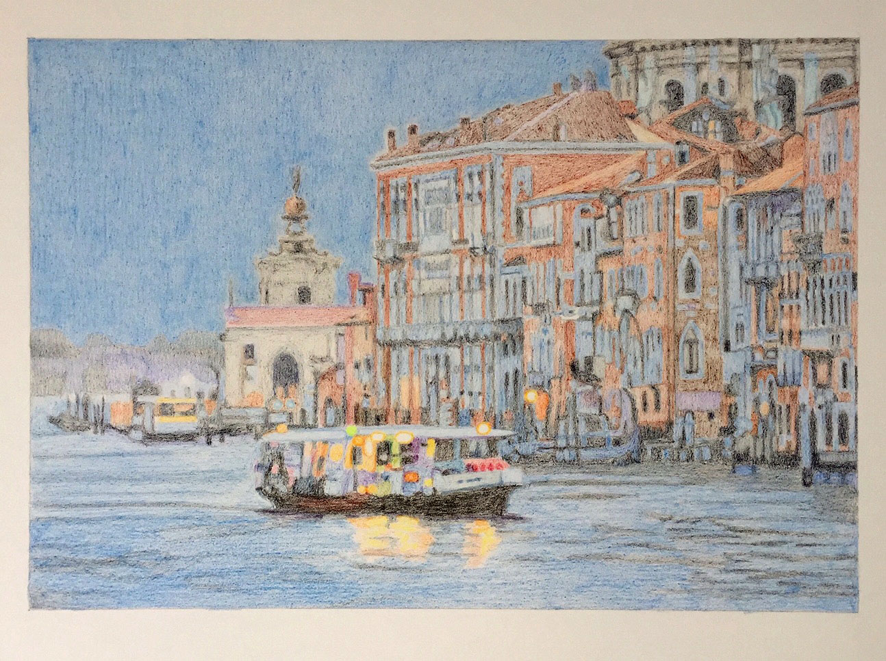
An Italian Dream – technical note

In “An Italian Dream” I wanted the colours in the foreground to be the most deeply saturated parts of the picture, being closest to the viewer. So I put Neocolor II wax pastels down as undercoat for this water/boat area. The sky, hills and buildings have no Neocolor underneath. They are rendered with coloured pencils only. Having wax pastels for the pencils to work into and over makes for a finish of delicious intensity.

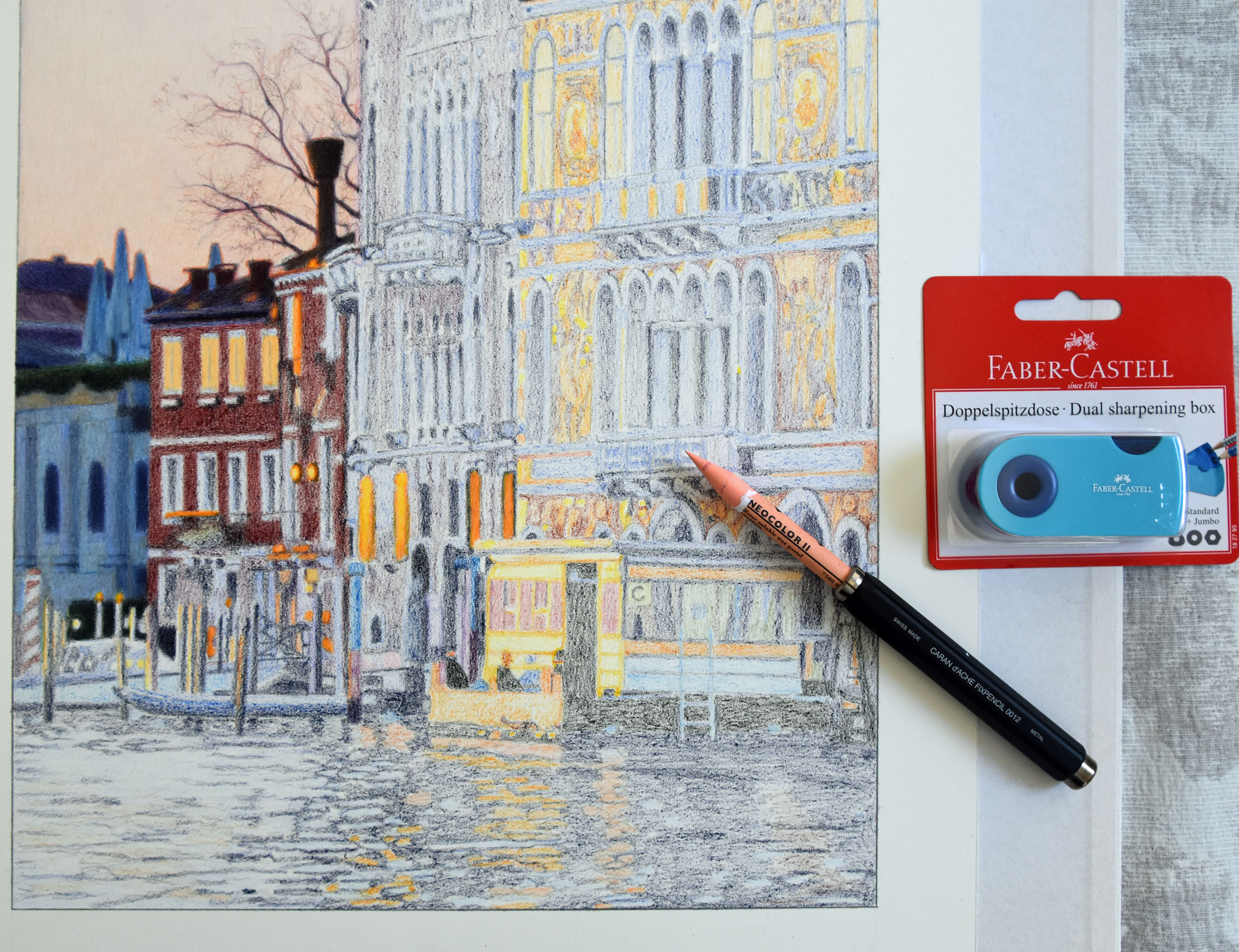
How do I manage to do fairly detailed work at the undercoat stage with Neocolor? The answer is that I sharpen my Neocolors using the Faber Castell dual pencil sharpener. The larger of the openings of the dual sharpener fits Neocolor perfectly.
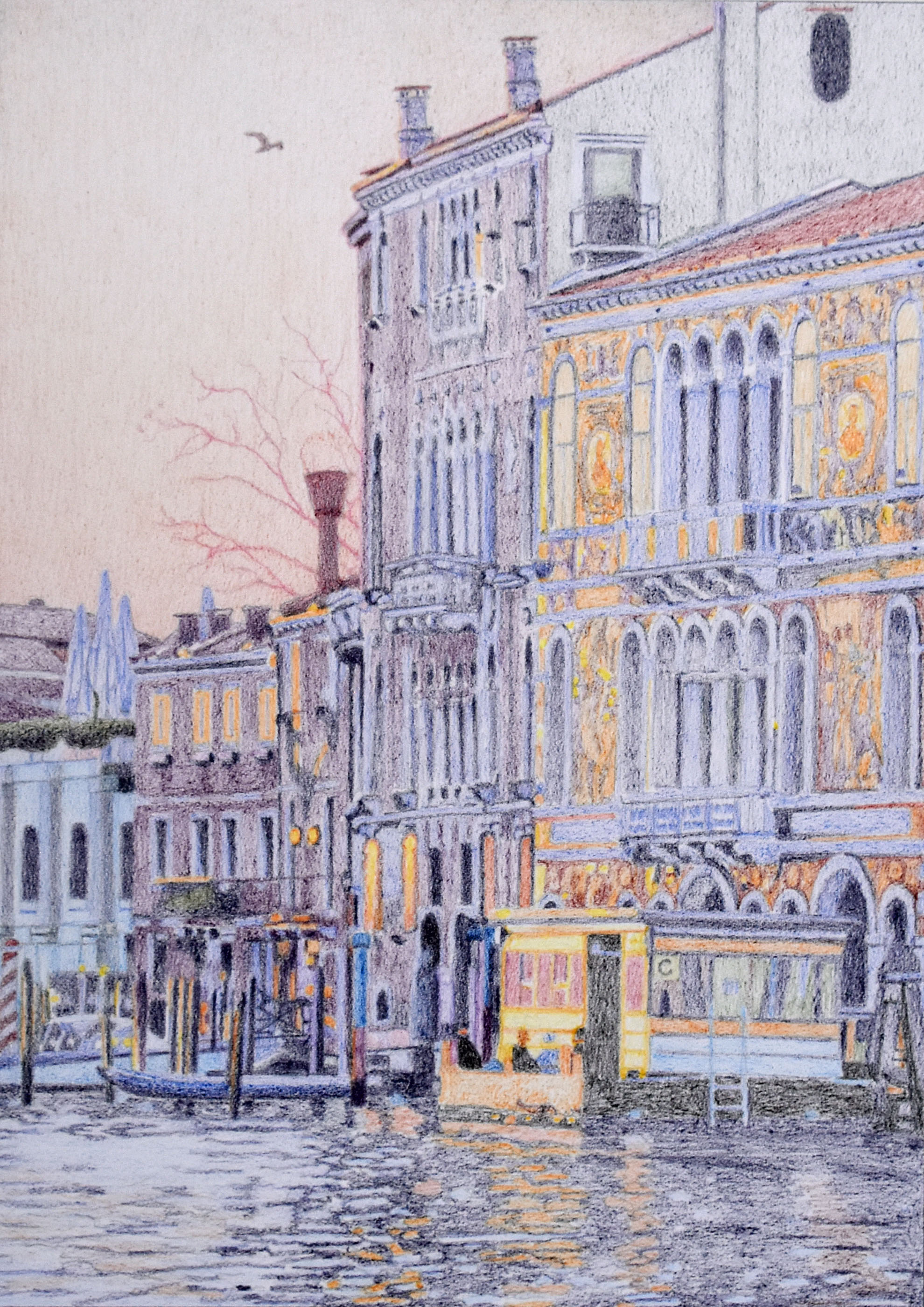
Currently (January 2021) I am working on a drawing of sunrise on the Grand Canal.
When you see the Luminance colour go over the top of the Neocolor undercoat, you can appreciate by comparing the coloured pencil with the pastel areas how lightly I use the Neocolor. Neocolor maps in the shapes with the lightest pressure. The Luminance going over the top does 95% of the work. Despite the light pressure of the Neocolor, its presence makes a difference – enriching the work as a whole.

The drawing continues – Luminance over Neocolor gradually moving from left to right across the buildings. Also I adjust as I go, for instance, intensifying the glow in the sky.

In the next image I am working on the building on the right. These are not its final colours; rather, it is perhaps half-way completed.

Finally, the finished piece, “Morning has Broken”. Ready for my April 2021 exhibition “An Italian Dream”. (You can have a sneak preview of all the pieces which will be exhibited HERE.)

February 2022: I photographed another drawing in stages. Here are six stages of “Box Seat” .


Dear Julie,
I just wanted to thank you for sharing your processes! Your work is always stunning and I agree the Italian landscapes particularly look great with that soft romantic finish!
Hi Lyn, thanks for sharing your thoughts with me, which I very much appreciate! cheers, Julie
Thank you so much for your generous sharing! I have my neocolours and luminance out to play today! You have inspired me yet again dear Cousin!
It is part of a cousin relationship to share ideas. I hope that after some testing you will let me know your thoughts on this combination of materials, Cousin Canada.
Its fascinating to see the progression of the work. The Neocolor base is such a lovely soft underpainting – its actually beautiful even at that stage, but clearly adding the pencil on top enhances the richness and depth of the drawing. Its also interesting that the colours you use in the underpainting are not necessarily the same as what goes on the top – colour theory comes into place here I think! I’m looking forward to the finished piece!
Good morning Anna! I don’t think it would matter all that much which Neocolor colours I chose for underneath – in fact I was mulling over the idea of using all greys – maybe one day. Because actually the main influence over the drawing is the TEXTURE of Neocolor and how it changes the substrate.
I’m thinking I like Neocolor as undercoat more than either Neopastel or Sennelier oil pastel because I’m not aware of pastel dust of any sort. There is a dust issue with Neopastel, while Sennelier is almost too thick so one is always wiping globs of it off the pencil lead. In working over Neocolor, the process is very clean.
Ah, that’s interesting. I love the colours of Sennelier, but the texture and thickness I find really hard to deal with. Yes, you could start with a classic grisaille underpainting!
Yes, exactly, Sennelier is rather overwhelming. To me it is more like oil paint than anything else. Neocolor is far more gentle.
This is a great post, Julie. I am looking forward to the follow-up and am keen to experiment with this medium. Thankyou for sharing.
Brigitte
I’m pleased to have inspired you to experiment with Neocolor, Brigitte. Do let me know your thoughts when you try it out. As to the follow up post – heck – I hope the drawing works out. I’d have egg on my face if it didn’t after this post. (Hence, I’m going slowly and carefully!)
Hi, Julie. Have you heard of special edition Neocolor 2 Fall set of 10? Assortment includes Gold ochre, Green ochre, Natural sienna, English red, Indian red, Chestnut brown, Vandyke brown, Black olive, Moss green, and Grey black. And there are also Winter, Spring, Summer. My, my! But they seems to be colours yet in the 84 colour chart.
Hi Laura, no I am not aware of these small sets of seasonal colours. Though I know Caran d’Ache do something like it with Museum Aquarelles, for instance having landscape, seascape and portrait sets of particular colours. (I’m not sure exactly how they categorise them, something like that anyway.)
Wonderful techniques and artwork. I’m new at colored pencils, so this is great, new techniques for me to take in. Your out focus style is fascinating, I simply love to look at your work.
Thank you for sharing.
Mireille
Hi Mireille, very nice to read your comment. If you come up with questions, please ask. I’m not the best explainer but I’ll do what I can.
Wow, honestly, I didn’t think this would work! So creative and unique. Thank you so much for sharing! Your paintings are so beautiful and the way you use blur is dreamy😊
Do you believe this will work with other colored pencils as well? Should they be on the harder side?
I’m thinking of using my neocolors instead of a softer pencil like prismacolor, but like many others I thought they would go on top 😊. It makes sense to do the details with a hard pencil last though.
Time to experiment!
This would definitely work with other brands of coloured pencils and no, they wouldn’t need to be hard. Go for it!
Thank you, I will!! Have a lovely day ☺️
Thanks! You too. I’m in New Zealand at the moment where there are only two hours left of 19th February.
Hi Julie wow, l’m absolutely blown away with your ” Italian dream” it is stunning to say the least. I am completely mesmerised by all of your beautiful expressions, they are like meditation for me but at the same time the colours excite me so that l get a surge of inspiration to try to get the same brilliance of colour with my own drawings. Bless your kind and beautiful heart for sharing your knowledge ❤
Thank you for your beautiful comment which is very much appreciated!
Hi Julie, you mentioned both Neocolor I and Neocolor II. Was there a reason for you choosing one over the other for a particular drawing?
I didn’t know colored pencil art could look like yours. Amazing!
Hi Jennifer, both are fine. I use Neo II (when I do use it as much of the time I use only coloured pencils without anything else) because there are more colours in the range than Neo I. That is the main reason. But also Neo I have a drier feel to them and I prefer the slightly creamier feel of Neo II.
Thanks for your question!