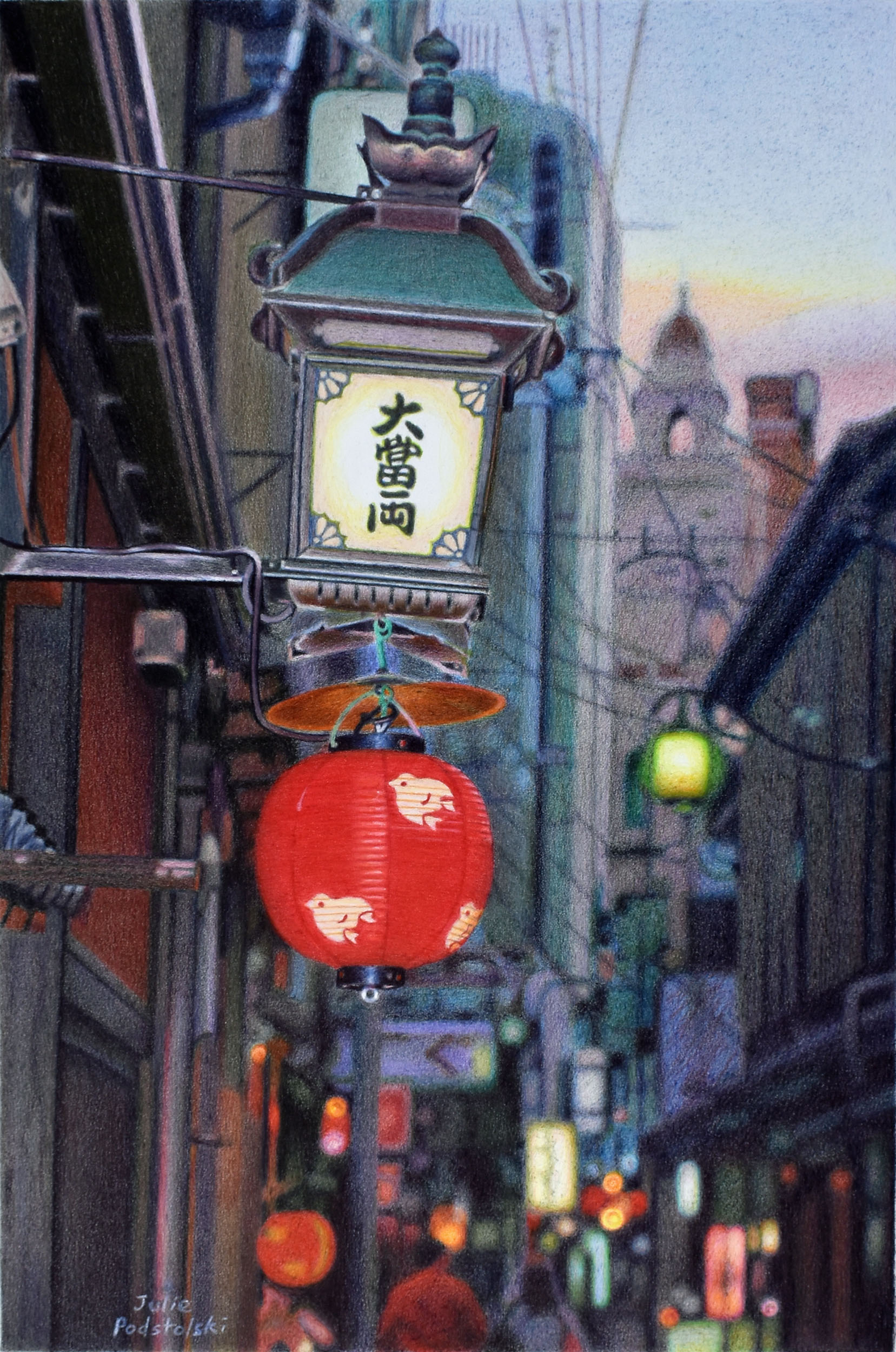
Kyoto Twilight
It was November 2005. Having used a film camera for decades, this was my first trip to Japan with a digital camera…a Nikon D70 if I remember correctly.
I wandered around Pontocho in Kyoto just as the light was morphing from daylight into evening – which is my favourite time. Lanterns and neon lights were popping on as the sky, not to be outdone, radiated its own quiet glow. I captured the moment with my new camera.
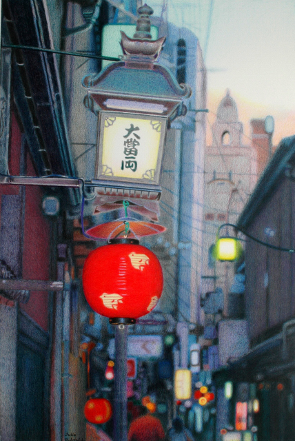
Back in 2006 I used the same source photo for another drawing which I called “Illuminating Dusk”. Because I have always loved this composition, I wanted to have another go at it in 2024.
The main lantern, incidentally, has been gone for years so if you go to Kyoto you will never see this scene. I suppose that makes this drawing a little bit of history.
My friend, Hiroo Inoue, explained about the lantern in a letter in 2006 after I showed him the drawing I’d made. He wrote, “The kanji letters say DAI TOMI RYO, literal meaning is Great Wealth Ryo Ryo. This has various meanings like monetary unit in olden times and it also means “both”. Probably Dai Tomi Ryo is the name of a Japanese restaurant. During summer time those Japanese restaurants along side of Kamogawa river, they stretch verandahs over the river. They place mats on the extended verandahs where you enjoy the sound of river flow, also enjoy Japanese dishes. Dai Tomi Ryo can offer such services during summer season”.
Rest in Peace, Hiroo-san.
Afterword: A friend commented that she thought I was brave to work twice from the same photo. I explained it this way; I saw Kyoto with fresh wide-open eyes in my early trips so I photographed things I wouldn’t even “see” when I became more familiar with the place. Now I see these early images as treasure. I bring an evolved pencil technique to the old compositions which make the finished new drawings completely different to the original drawings.

Lovely, as always Julie!
Thank you, Lana!
This drawing is radiant – so interesting to compare it to the earlier one. Both beautiful, but the new one has a depth and energy that the earlier didn’t. Your style and technique have not changed but the experience you have accumulated over the years has intensified and added a layer of sophistication to the work, making it somehow a very satisfying cohesive whole. I’m with you in loving that time of the day, it feels so full of promise, and here that is captured.
I think my technique has evolved quite a lot over the years, but that’s my interpretation. To me, this new one has more going for it than the original. I struggled very much with both of them which just goes to show that if you work from at the same subject twice, the second attempt isn’t necessarily any easier than the first.
It was this subject first time round which made me think of Paris and perhaps I’d like to draw it. It may be the building at the back with its little tower which somehow suggested Paris to me.
There is distinctly a sense of Paris – I think it is the little tower, and the feeling you are looking up, like in so many Paris backstreets.
I am fascinated by the differences between these two drawings. Did you darken the colours? It looks later in the evening….
The two drawings are from one photo I took, but two different prints of it. In the old drawing I used a photo print I made from the printer I had back in 2006. The new drawing references a photo print I made from my current Epsom printer. The photo prints are very different from one another, hence the drawings are as well.
When you see the drawing in real life you’ll see that it isn’t as dark as the image you are seeing on your device. The photos I take of my drawings never look quite the same as the drawings.
Where would we be without RED ! and glowing red at that .
A beautiful play of neutrals , Julie , I cannot imagine how you can capture such subtlety of tones .
I have forwarded your image to Minoru , but don’t expect him to comment ;it might compromise his masculinity to admit that something is beautiful (especially art ) .
Judy.
Ahhh – thank you, Judy! I have come to love the films of Yasujiro Ozu. He made films from the 30s to the 60s. Just his last few films are in colour – and boy, does he know how to use colour – especially in his placement of reds. This drawing is a nod to Ozu. I even named it after one of his films – in a way. He made a film called “Tokyo Twilight” so I called this “Kyoto Twilight”. Ozu’s most famous film, which you may have heard of, is “Tokyo Story”.
In my drawing I see this main lantern rather like the red circle on the Japanese flag (which stands for the rising sun I believe).