Tapestry
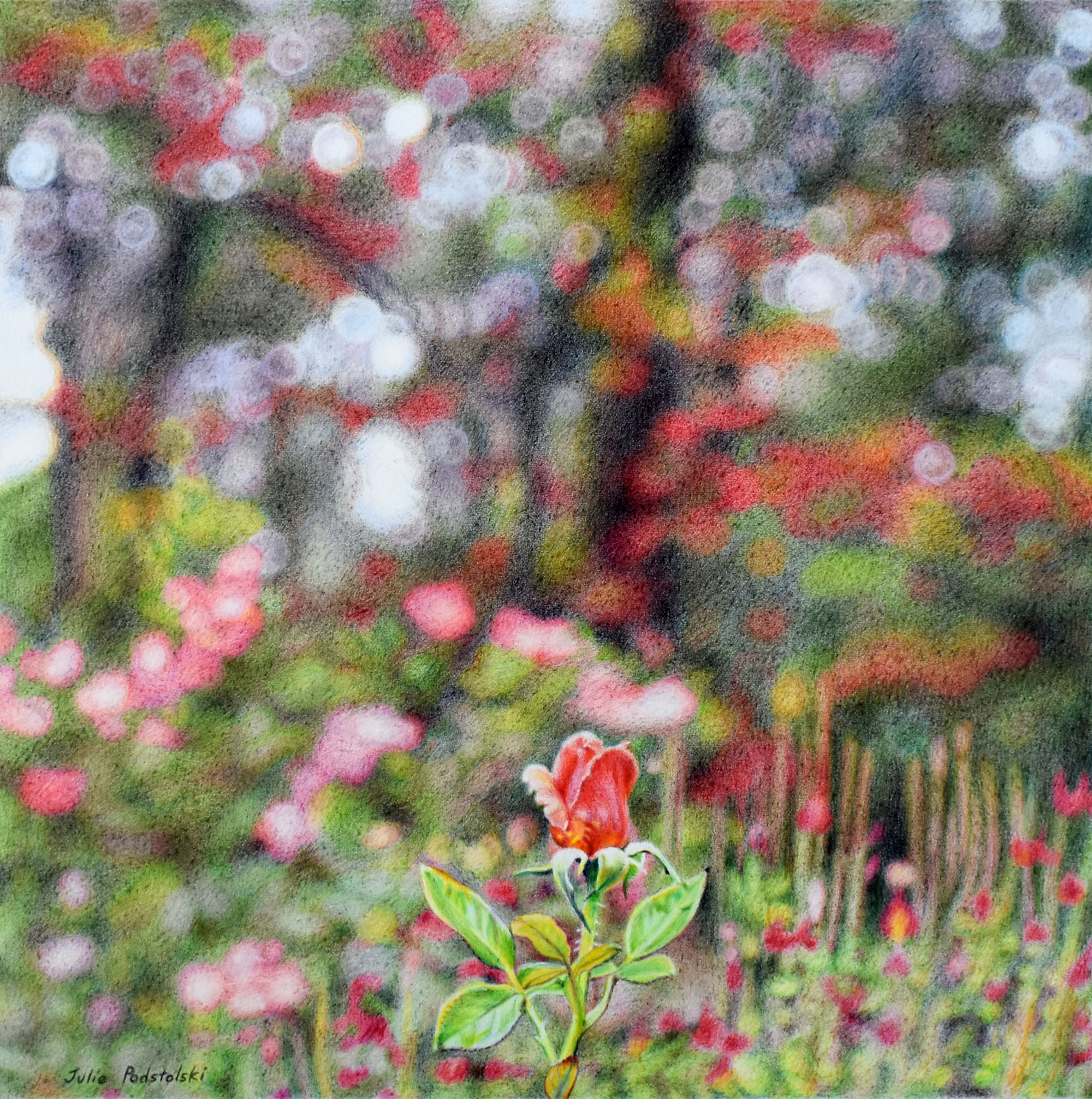
At the upper section of Araluen Botanic Park in Perth’s hills are the rose gardens. Rose and salvia bushes are framed by a backdrop of both native eucalyptus and introduced deciduous trees – the latter in autumn leaf.
This drawing changes depending on your viewing distance from it. It comes together from across a room so I invite you to move back from your screen to create a little distance between you and it.
“Tapestry” is in the same genre as these two below; my aim in each of them is to suggest a dreamy atmosphere of space and light in nature.
and…
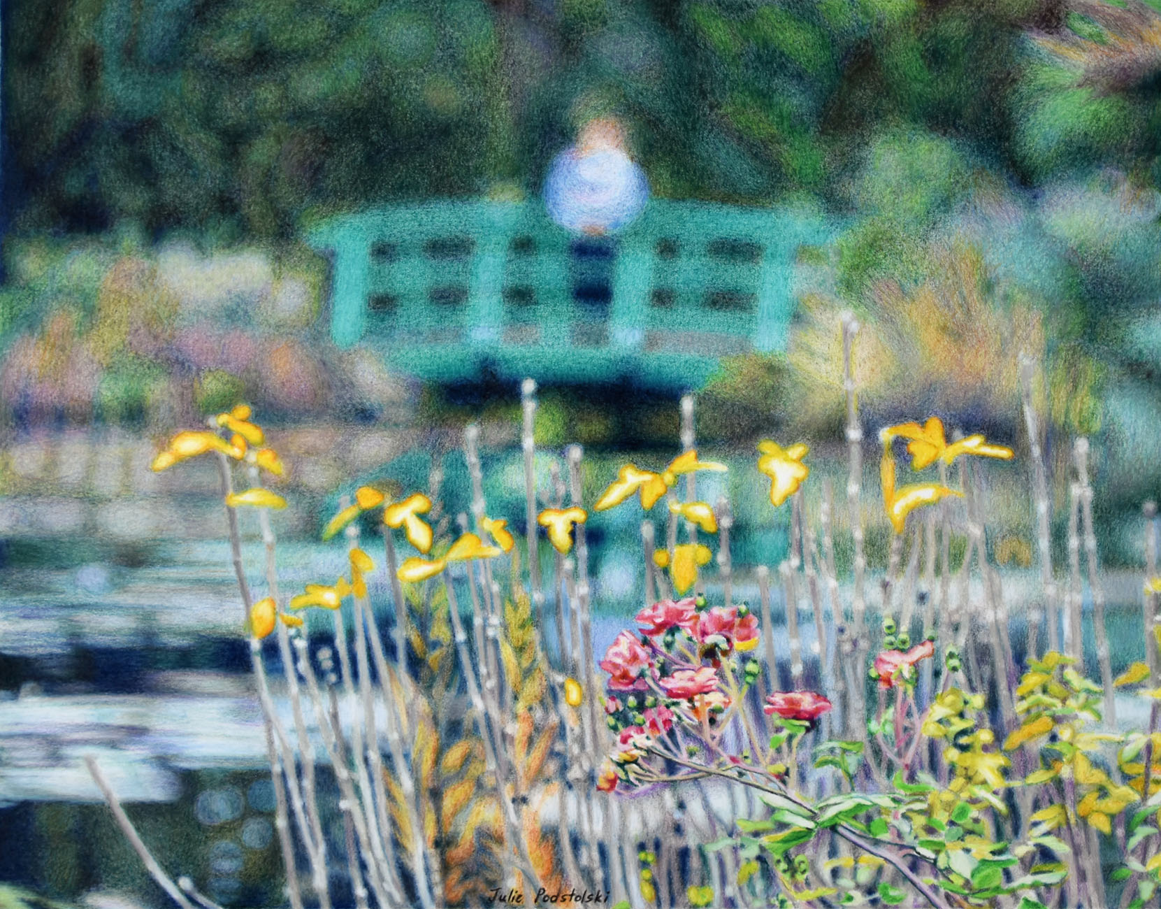
“Day Trip to Giverny” (2018) is a favourite of my drawings and it hangs on my bedroom wall. It gave me courage to attempt “Tapestry” and reassured me when I doubted my ability to make this latest drawing work.

This drawing is stunning, and really does work on several levels, even though I am only seeing it on my phone. It’s the kind of image that you can keep coming back to and finding more. It meshes beautifully with the earlier works too. Bravo!
I’m so glad you think so, Anna. After I was quite sure it was finished, Matthew asked, “So is it finished?” which made me anxious that it might not be quite resolved. It was a perfectly innocent question but shows how over-sensitive I can be! In any case I decided not to put another mark on.
It’s different from the ones you do with a very distinct central element, but it still has a complete feel to me too!
I decided to revisit the drawing and have worked more on it today. I hope I haven’t killed it. I will have to rephotograph it next time it isn’t raining. Ho hum – I felt there WAS more I needed to do. But was I right? I have no idea.
Have faith! It will still be beautiful.
Mesmerising Julie. I was immediately tempted to adjust my screen. Beautifully dreamlike – so much so one wants to stay. The rose bring you back to reality. Your talent is a feast for the soul. Thank you ❤
Ha ha !! You wouldn’t be the first person who felt the need to adjust your screen when looking at one of my drawings. Thank you for your generous words!
Just beautiful!!! You are incredibly talented! I look at your work and think “I wish I did that.”
Marvellous works!
Thank you so much!
This is such a magical portrait. It is as if the background is an expression of the joy of the Rose. Softly yet exuberantly vibrating.
Oh Robyn, you are poetic! Thanks for this beautiful comment.
Tapestry is a master work. Brava!
Thank you Tamara. Actually I’ve done more work on this since I published this blog post. I will re-photograph it when the sun next shines (maybe tomorrow) and then put the updated image on this post.
I look forward to seeing it!
The updated image is now on the blog post (replacing the original image posted).
The revision is beautiful but I really enjoyed the abstraction of all that bokeh in the “ unfinished” version. It would be hard to choose between the 2. One thing remains and that is Tapestry is the perfect title.
Hi Tamara, yes, it was mostly the bokeh that was annoying me. I started with that but ended up doing lots more adjustments. The result is that it has more substance and depth now. I have to say – this picture presented challenges.
May I please ask how you created the brilliant white dapples in “Tapestry”? I have such trouble getting genuinely bright whites in colored pencil.
I am so sorry, I misspoke in my previous question just now. It is “Transcendence” I am asking about, not Tapestry (though that is amazing, too!)
Hi Catherine, My bright whites are thanks to a Japanese brand of pencil called Holbein. Have you come across this line? I used to use them extensively but some of the colours tended to fade so I switched to Caran d’Ache Luminance. However I still use Holbein “Soft White” number 501. In my experience it is the best white of all coloured pencil brands.
The other part of the answer is how I manipulate the dark tones around the white areas making them contrast to white as much as possible in order that the white really stands out. And I’ll often put an edge around the white; perhaps an edge of orange or blue or yellow which gives the areas a glowing effect.
Thank you so much, Julie. On close examination, I see how you used darks and that band of a glowing bright around the white to create the luminosity in your dapples. I’ll try it!
I have tried the Holbein white, and though it’s beautifully rich and opaque, I found it to be crumbly and difficult to use in light layers. However, I was working on Pastelmat, and I imagine that is what made the difference. The work I’m thinking about with dapples will probably be on drafting film. I’ll try the Holbein again on that surface and see if it works better.
Thank you for your generosity in sharing your experience!
Hi Catherine, I’m sure it was the Pastelmat surface that your Holbein Soft White didn’t like. I know it is very soft and does tend to crumble a wee bit but that doesn’t bother me as it has qualities I can’t live without.